Painting with light is a way of using lights to create drawings through slowing down the shutter speed on a camera, and making shapes whilst taking the photo. I first came across painting with light when watching a blue peter episode, in the early days of the summer, I was interested in having a go at doing it; since the reporter went into really good detail in what it is (I have gave you a link to the clip in the link below), however I didn't have the appropriate equipment to do it, (a camera which I can adjust the shutter speed). Luckily for me though we are now doing it in class, and we are creating our own using the equipment my school has provided.
The work we did
|
|
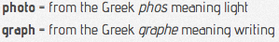
This is the photos we took in our group using light painting. Most of the photos were taken by Huck, he mostly commanded us what to do however we each sold eachother ideas. (It was my idea to do the hudoken, with the light painting, which I am very proud of). My job in the light painting photo shoot was to use the torches to create the streaks of light, which are in each photo. I really enjoyed doing this particular photo shoot because it was great telling each other ideas, debating over them, then taking the photos. You can see all the photos we did in our group, on the left slideshow.
|
|
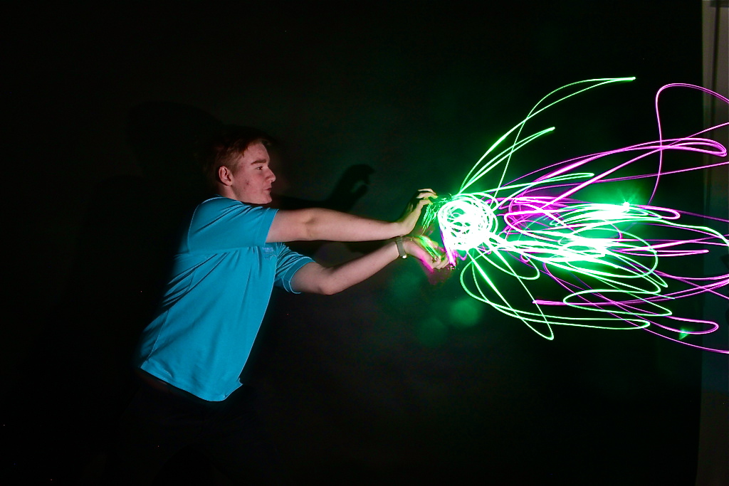
This is my favorite photo because I thought it was a really original idea. I really like the use of light painting we did in this photo; with the sparks of light coming out of my hand. I also admire the light reflecting off the front of my face, and the light slowly fades away as it edges nearer to my back. It's as if you can't see half of my body, which I find is a good thing because it takes the attention off of me and diverts your eyes on to the light drawing. I also like the choice of colours we used in the photo, I love the mixture of the green and the purple, they are two colours which work really well in this photo. Additionally, I like the black background which gives the colours that vital bit more boldness in colour. If I was too improve this photo I would have moved the camera slightly to the left. On the right hand side of the photo you can see behind the background, and part of the wall. This breaks the illusion however this is still a very good photo, which I'm very happy with.
|
My favourite photo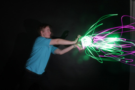
|
My least favourite photo
This is my least favourite photo. The reason why I don't particularly like this photo, is because the shutter speed may have been too long, also the ISO may have been too high. If I had reduced the ISO from 800 to roughly 400, the camera would have been able to control that amount of light. Another reason why the photo was not as good as I was hoping it would be is because the light may have flared. When originally taking this photo, I experimented with moving the torch in different ways to create a more interesting photo. I moved the torch closer and away from the photo, instead of doing the usual, moving the torch left to right. This made the light flare slightly, which created the light on the outside of the intense part of the light.
Below is the setting I had used for creating this photo:
Below is the setting I had used for creating this photo:

Improving my favourite photography
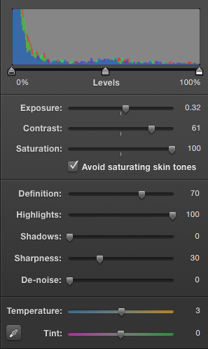
What I have done to improve this photo, using Iphoto:
|
When editing this photo I simply used Iphoto. When editing this I wanted to make sure that I gave this photo the sharp definition it deserved. I wanted the colours to be the main focus of this photo, which I did when I put the highlights to 100 and the sharpness to 30. I also avoided saturating the skin tone, I wanted the colours to be really bold and intense and not my face, because my face isn't the main focus of this photo. I also increased the exposure, the reason I did this was to decrease the amount of light going through the photo, this would have therefore made the coloured light more noticeable and really made the colours more bold and stand out. On the other hand I did not experiment with the temperature and the tint of the photograph; Perhaps next time I do this, I could use these settings to my advantage. When I tried doing this, it really messed up the colours and the photo had a really horrible theme of blue, which didn't improve the photo, and made it worse.
|
