Abstraction
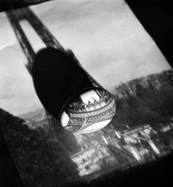
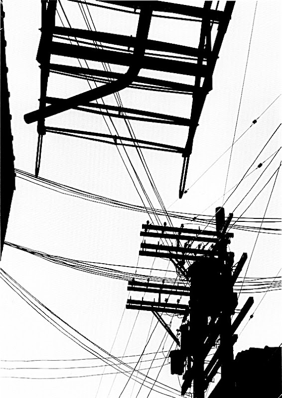
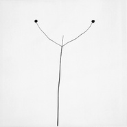
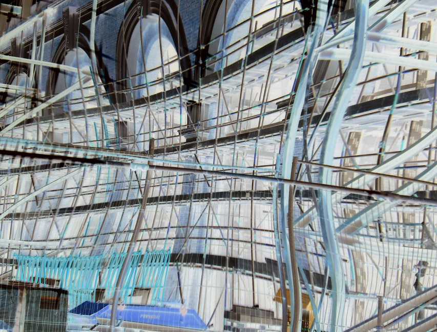
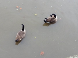
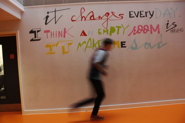
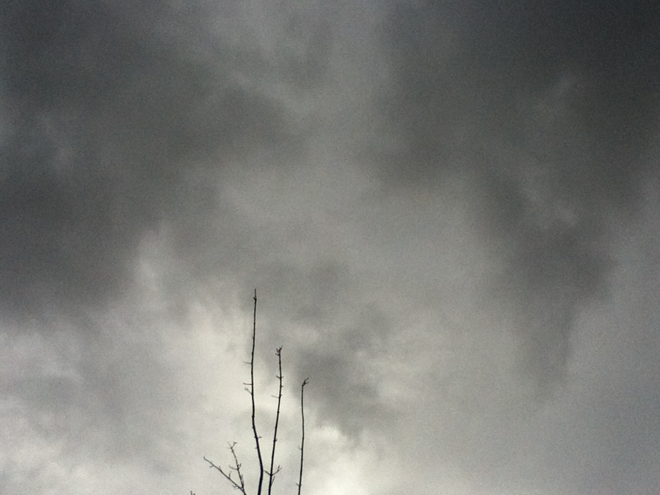
We began our adventure into abstraction by looking at this first image. Our teacher instructed us to create 6 open questions, (questions which don't have a yes or no answer) and organize them into a pyramid with the most important at the top and least important at the bottom. We therefore asked the following questions:
1) Why did the photographer decide to take the picture in black and white?
2) What is its purpose?
3) What effect is it meant to have on the person looking at the image?
4) Where was the image taken?
5) Who is the photographer?
6) What's the story behind it?
1) Why did the photographer decide to take the picture in black and white?
2) What is its purpose?
3) What effect is it meant to have on the person looking at the image?
4) Where was the image taken?
5) Who is the photographer?
6) What's the story behind it?
|
This is how we eventually decided to organize the pieces of paper, in order of importance. At the top of the pyramid, as a group, we decided that the most important question concerning the photograph was "what effect is it meant to have on the person looking at the image?"
|
|
Focus |
Lines |
Light |
Repetition
|
Shape |
Space |
Texture |
Value/tone |
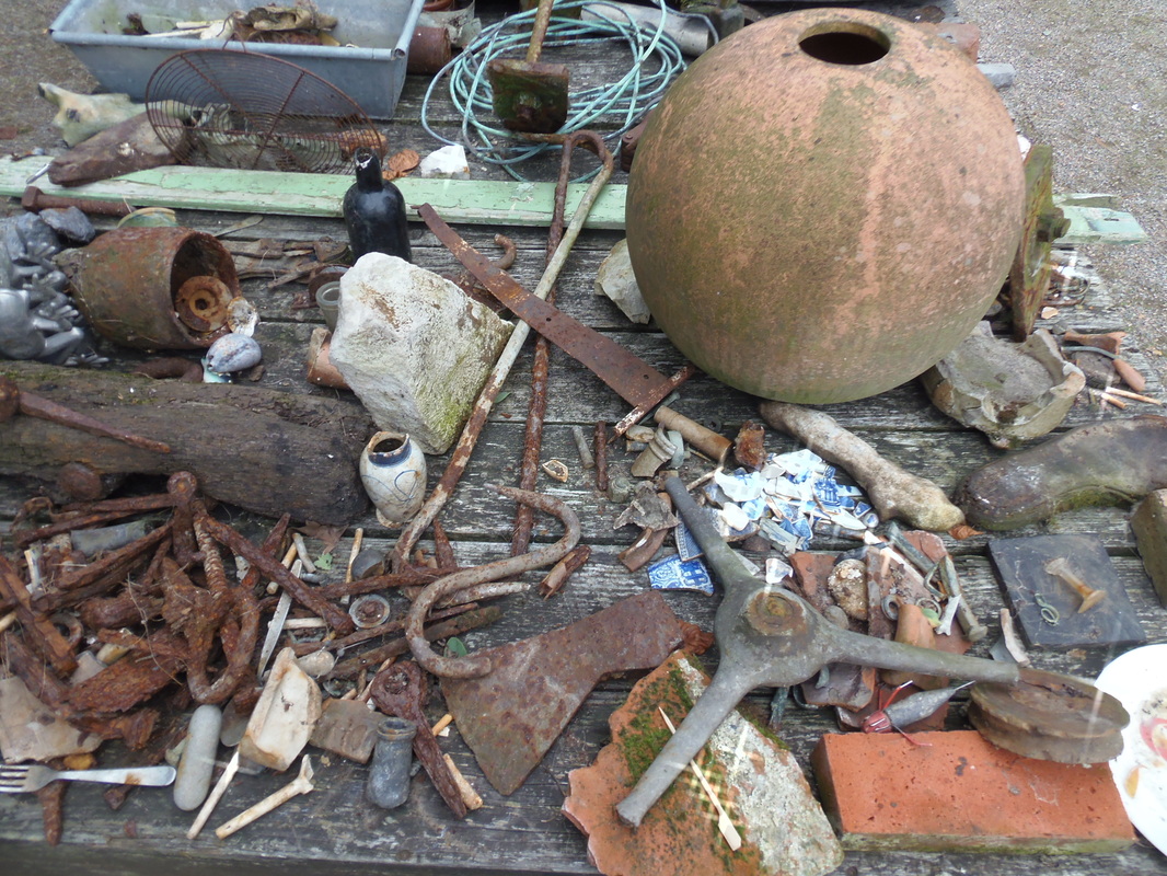
Research into the history of abstraction
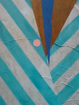
The beginning of abstraction in art came about when a series of artists began to move away from the more traditional techniques of creating art. Picasso for instance is an artist who moved towards cubism which is arguably the first form of abstraction, in which he would focus on bright colours and shapes to make a quality piece of art. Another artist which certainly pioneered the idea of abstraction, is the Russian-born artist Wassily Kadinsky.
Examples of Abstraction in photography |
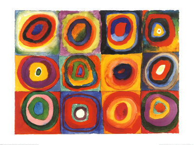
An example of Wassily Kadinsky's work.
|
Focus
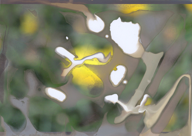
I began my first abstraction project by looking into focus, which is one of the formal elements which make a photo. I really liked the idea of using focus as the formal element which I would look at, I think that photographs which I had previously look at which involve focus are always effective, so I decided to have a go at it myself.
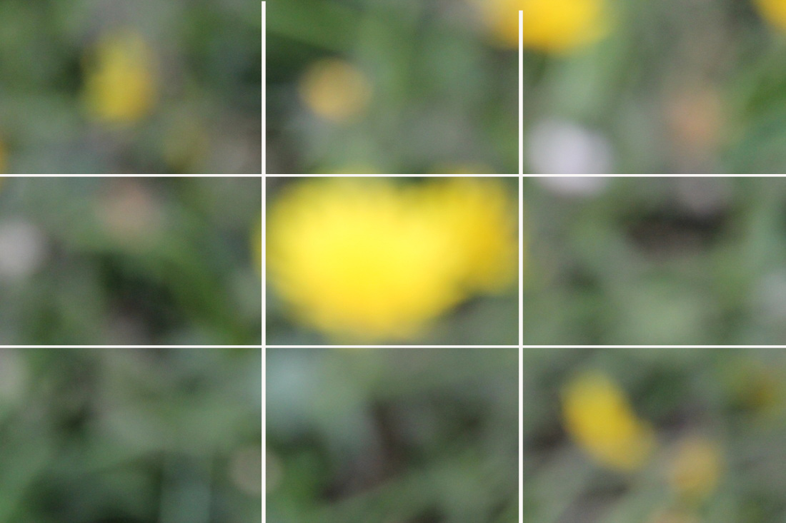
My favourite image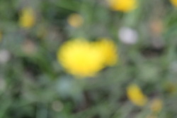
This is my favourite image which I took during the whole photoshoot. I think the reason I approve of this photo so much is how I have used focus, to turn a flower, into something that looks completely different. I also think that the usage of proportion are also effective (the yellow orb is in the centre of the photograph).
|
my least favourite image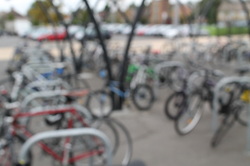
It's hard to explain why I don't like this picture as much as the other photo's. I think it's probably because the focus doesn't really add much of an abstract effect; you can still recognise that the objects are bikes, unlike the photo on the left. What I also dislike about the photo is how complex it is, I think what I really admire about the other photograph is how basic it is, I find that in this photo there's too much to look at it one space, this as well as the blurred effect consequently makes a photo which isn't very successful as a whole.
|
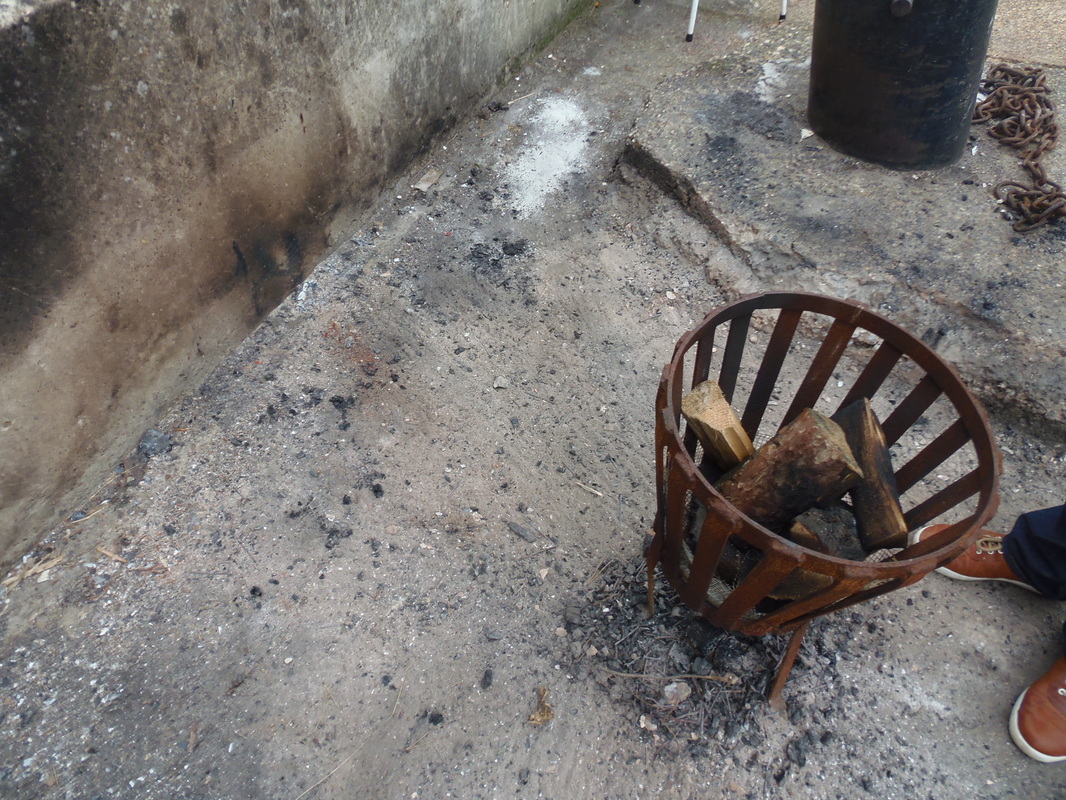
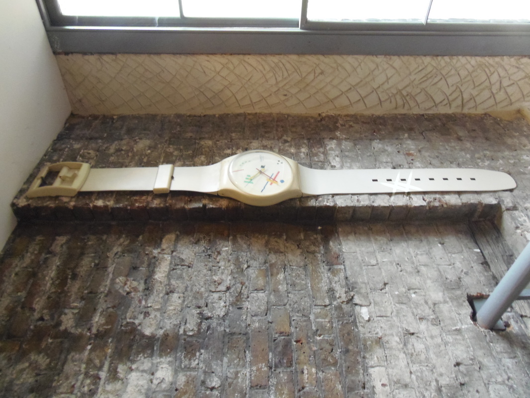
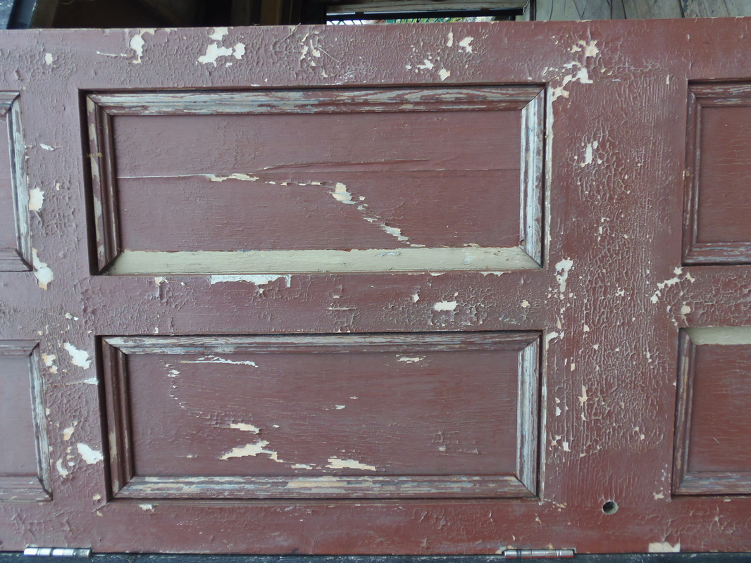
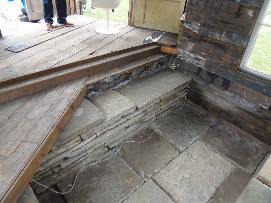
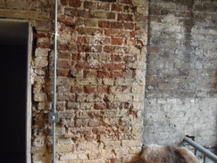
Formal elements - Texture
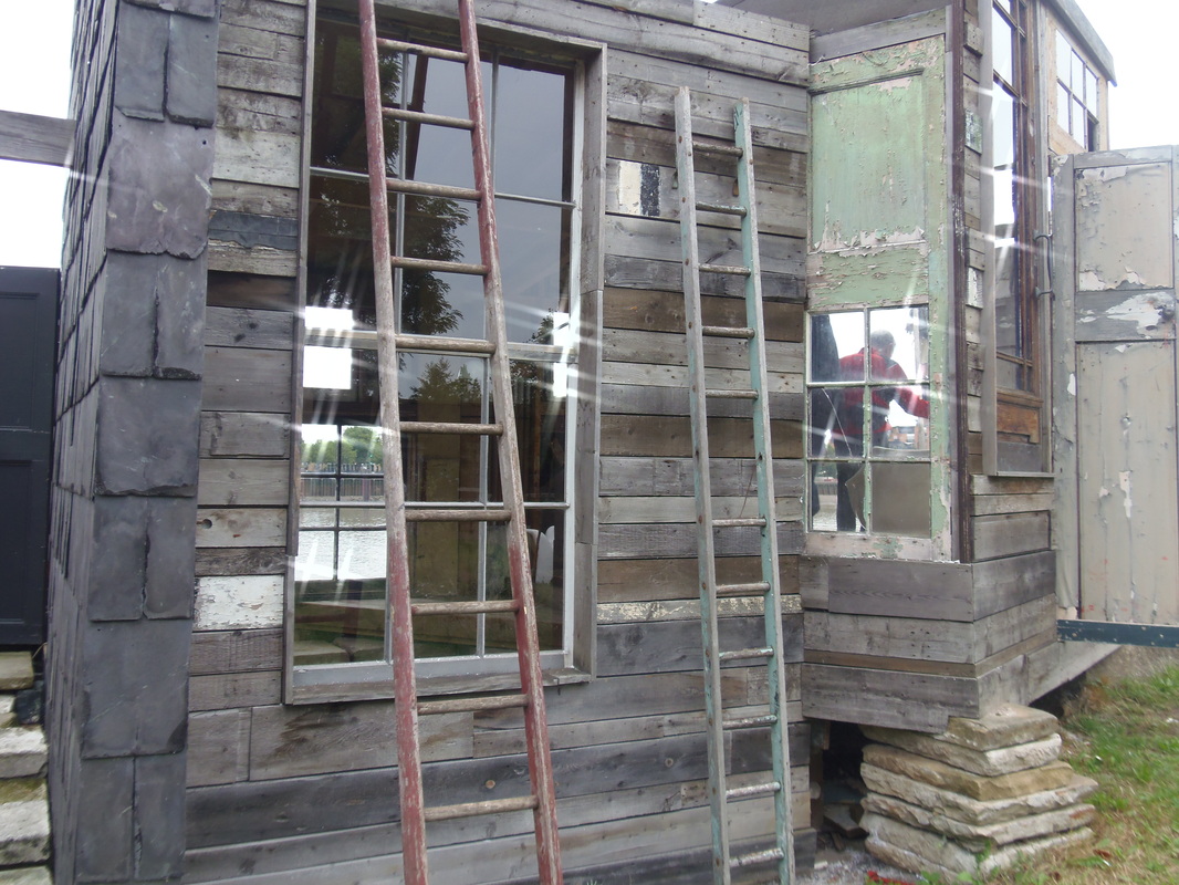
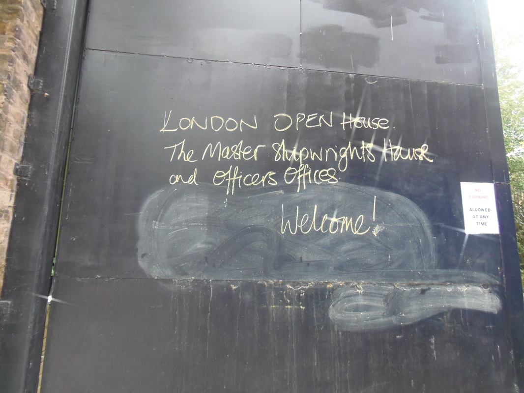
For this weeks homework I decided that textures would be an ideal formal element to explore, as we see textures everywhere in everyday (even if we don't recognize this). I have to say that this project was by far one of my favorite as all the photos were taken in such an interesting location, the photos were taken in house in Deptford which was part of the Lewisham open house weekend, in which numerous significant buildings were open to look around (and take photos in) in the borough of Lewisham. The house in particular I visited was the "master shipwrights house", which was built in the 1700's and was recently restored by the owners which allowed a really exciting opportunity's to take pictures of different textures.
Where were the pictures taken?
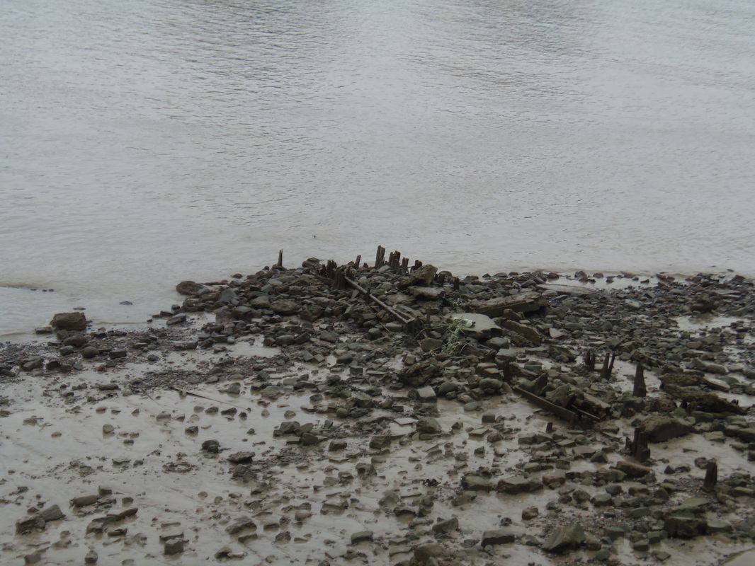
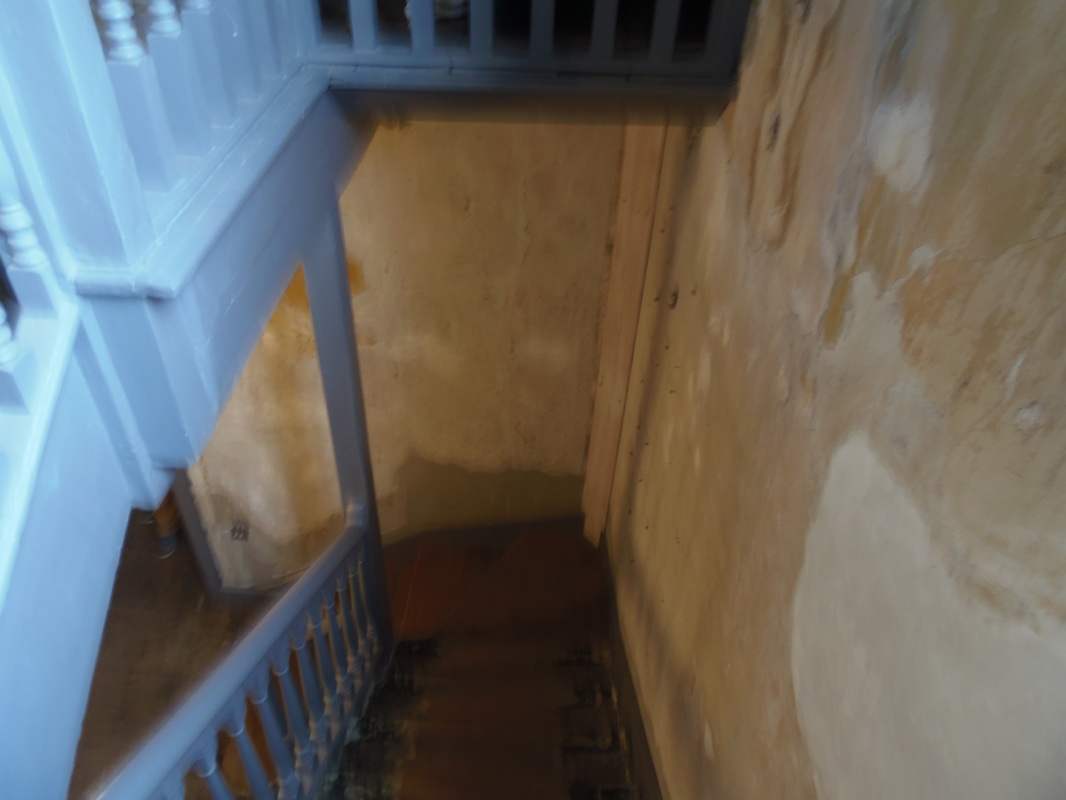

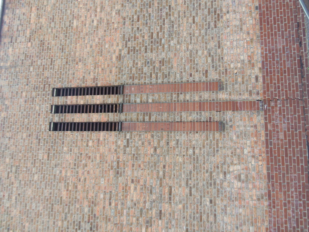
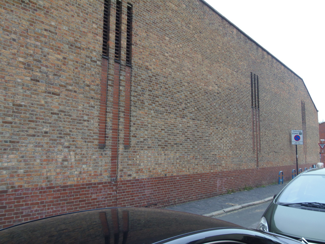
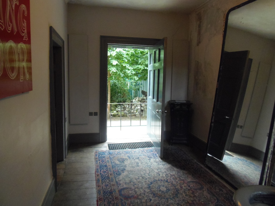
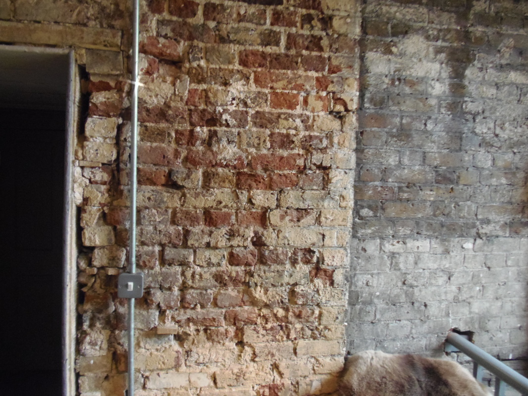
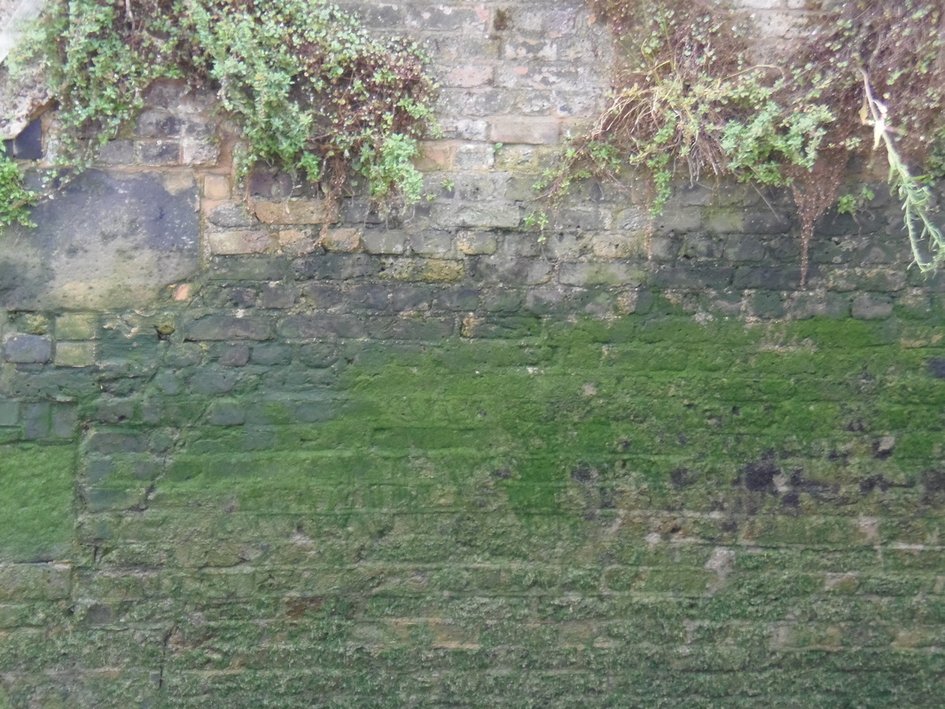
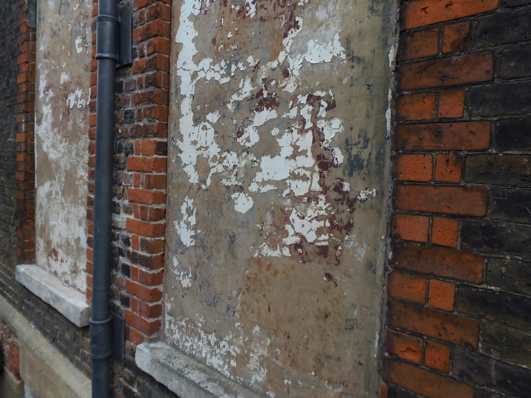
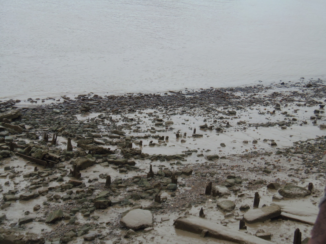

The problem I find with a number of these photos is that they don't quite hit the 'abstraction' category. Most of the photos have more of a naturalistic theme to them which is a shame
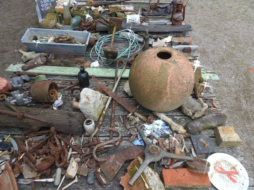
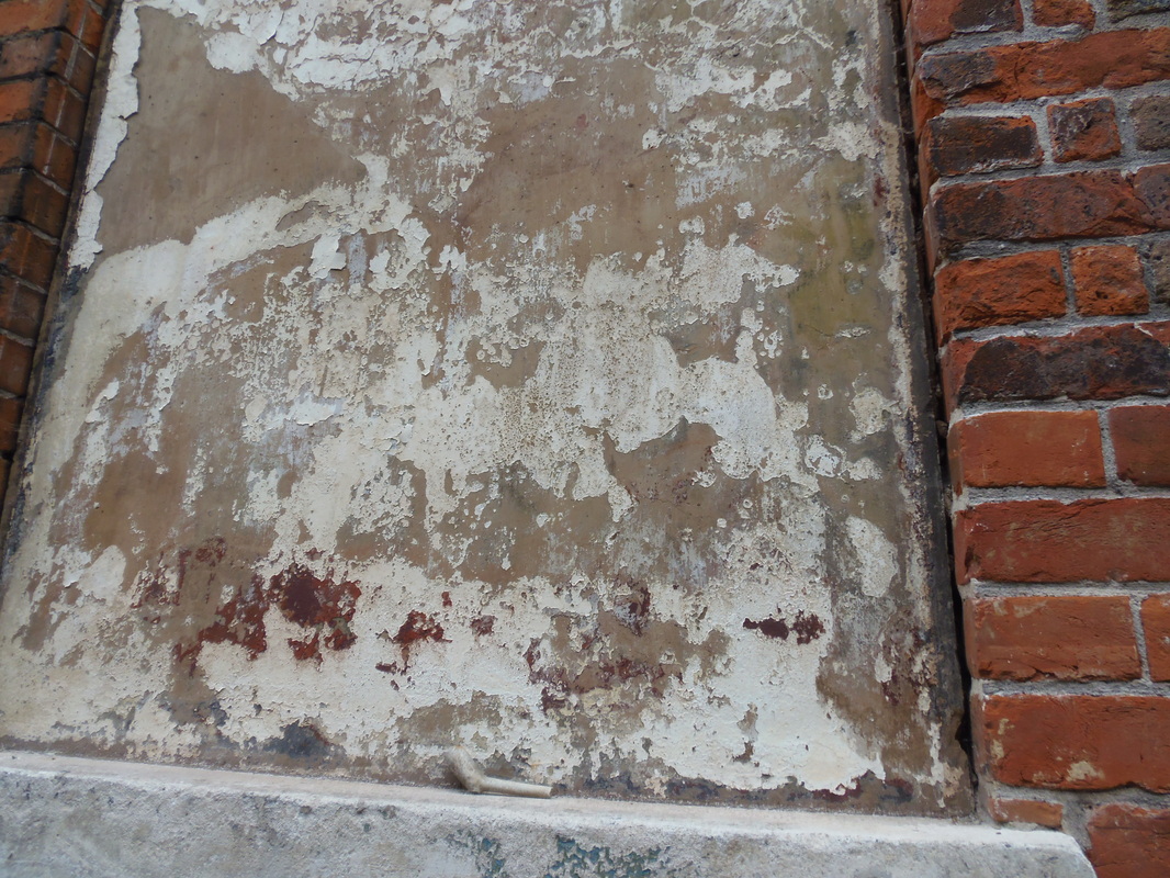
What I love about this photo so much is that there is a lot of things to look at in terms of content, ever corner in the photo has some sort of object to look at. The textures are also really effective in this photo... particularly the back wall, which a mixture of rough and smooth, which makes it all the more interesting. The objects in the photo certainly bring a feeling of curiosity when looking at the image: what are they for? Who put them there? Are just a couple of thoughts which come to mind when looking at the image. However a problem which persists in this photo is that it doesn't quite hit the abstraction theme unlike most of the other photos. If I were to take the picture again I would zoom in on a certain feature of the photo (for example a chair or the carpet on the floor). This would then explore texture in an abstract manor.
|

Although the textures are very good in this photo; I find that the camera wasn't very well placed in this photo. I think that instead of taking the photo at this particular angle, I should have instead fitted the whole window into the photo. So I don't think that the composition is good enough. What I also think, compared to the other photos, is that the colors are sort of bland this prevents the photo from being very engaging for the person who is looking at it.
|
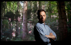
Ori Gersht
A photographer which I was interested in whilst developing these series of photographs was Ori Gersht.
Gersht is currently a professor of photography at the University for the Creative Arts in Rochester, England. Originally born in Tel Aviv in Israel in 1967, he graduated from The university of Westminster with an undergraduate degree in photography and film. During this time he was presenting his work at numerous galleries as well as being awarded different prizes in photography.
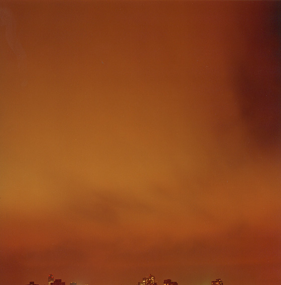
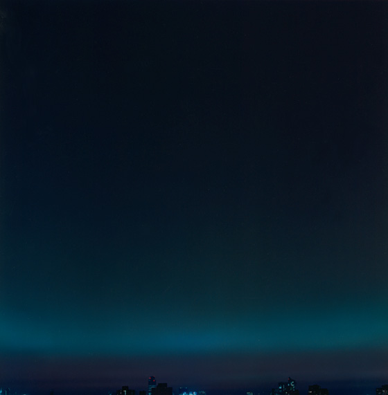
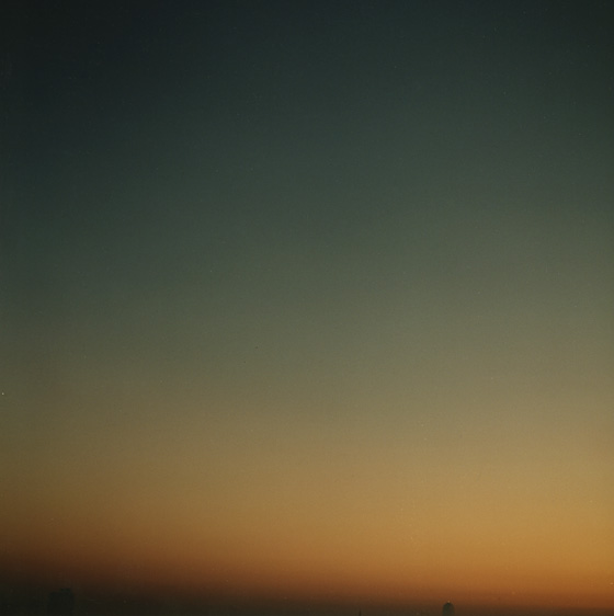
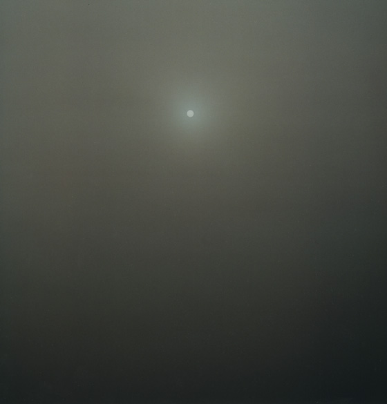
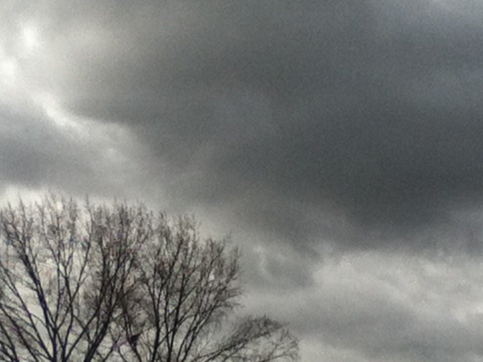
When further developing the photographs to make them more abstract, I took inspiration from the work of Ori Gersht particularly his series of photographs in which he takes pictures of the sky. His sky photographs uses color primarily as the main feature. His experimentation with color within each photo reflects the mood of each image. The darker colors present a gloomier mood (for example the second photo in the gallery below). I was interested in doing something similar to this in Photoshop; by experimenting with different effects which would create alternative atmospheres, in the end making a completely different photo which would provide a different mood compared to the original copy.
Gersht is currently a professor of photography at the University for the Creative Arts in Rochester, England. Originally born in Tel Aviv in Israel in 1967, he graduated from The university of Westminster with an undergraduate degree in photography and film. During this time he was presenting his work at numerous galleries as well as being awarded different prizes in photography.
When further developing the photographs to make them more abstract, I took inspiration from the work of Ori Gersht particularly his series of photographs in which he takes pictures of the sky. His sky photographs uses color primarily as the main feature. His experimentation with color within each photo reflects the mood of each image. The darker colors present a gloomier mood (for example the second photo in the gallery below). I was interested in doing something similar to this in Photoshop; by experimenting with different effects which would create alternative atmospheres, in the end making a completely different photo which would provide a different mood compared to the original copy.
Developed version |
Original |
|

|
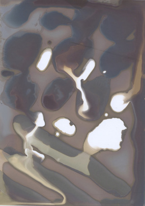
Chemigrams
A certainly more unique angle on abstraction is a form known as the Chemigram. These are created through different chemicals which are painted on to a small sheet of paper and placed in front of the sunlight. The chemicals then react to the sunlight and slowly become developed, turning into different tones of black and white.
|
This is the Chemigram which I made in class. I am very happy with my piece, as it is the expert combination of simplicity and effectiveness. What I like most about the Chemigram I created is that I eperimented with the amount of the time the chemicals would be visible by the light, instead of merely placing the chemigrams for a few minutes (much like many of the other students did) I placed it for at least half an hour. Because I left the Chemigram out for longer, the colours are much darker compared to the other Chemigrams in the class. However I like this as it allows the areas which are white to stand out, making the colors more bold.
Pierre CordierPierre Cordier is a pioneer in using "non-camera" photography. He has been described as the godfather of chemigrams. He was born in 1933 in Belgium and recently put on exhibitions all over the world including New York, London and Paris.
|
|
Combining images to create an abstract photo
This the first image I created combining both abstraction skills and using photoshop skills.
Using focus in photoshop
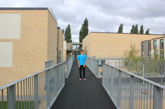
Before |
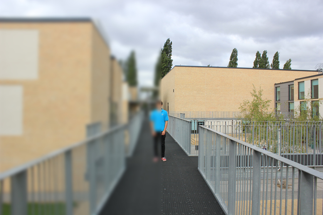
After |
From observing the before/after of these photos, I came to the conclusion that I great way of applying focus in photography, is using the focus effect in photoshop instead of using the actual camera for creating the blurred effect. I began by getting my friend to stand on the top of the link, which I thought was a really great shot in the first place, as the clouds in the background attach a really moody atmosphere

|
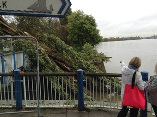
This is the first image which I originally took before tinkering with it in photoshop. I thought it would be a good image to use in photoshop as there is a lot of colour happening and there's a lot to look at in the photo.
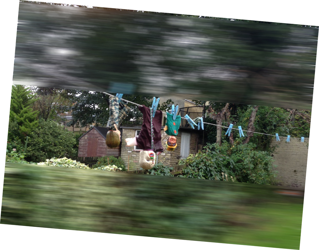
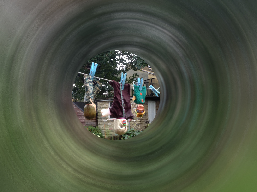
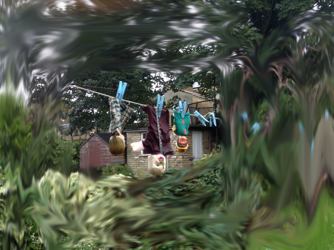
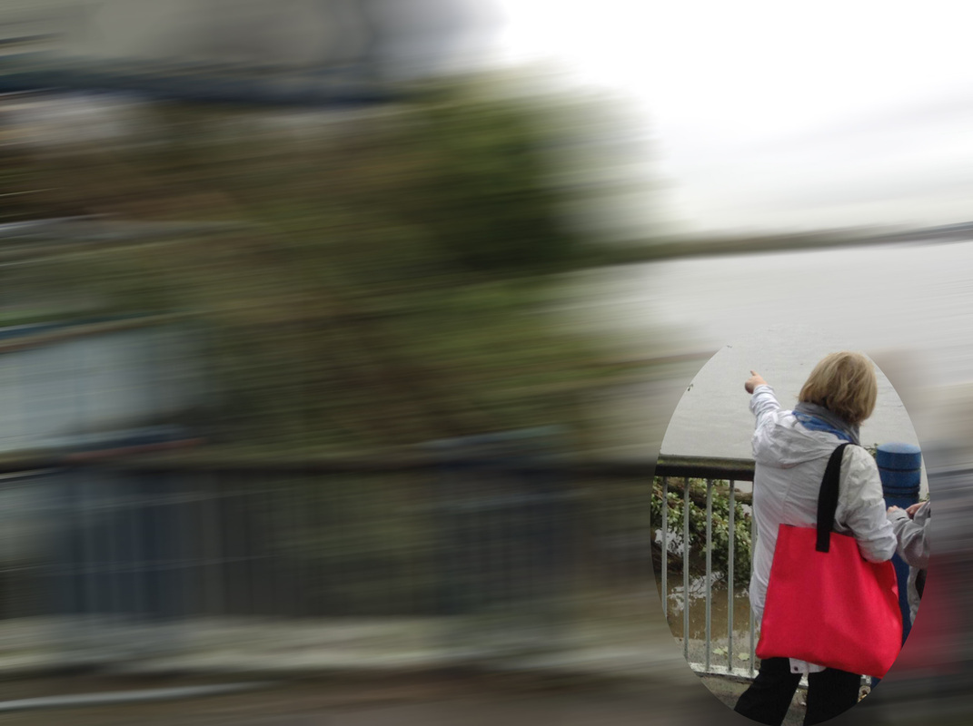
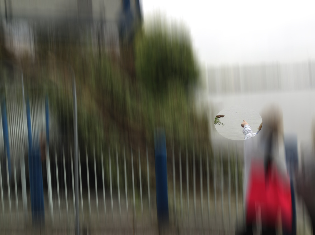
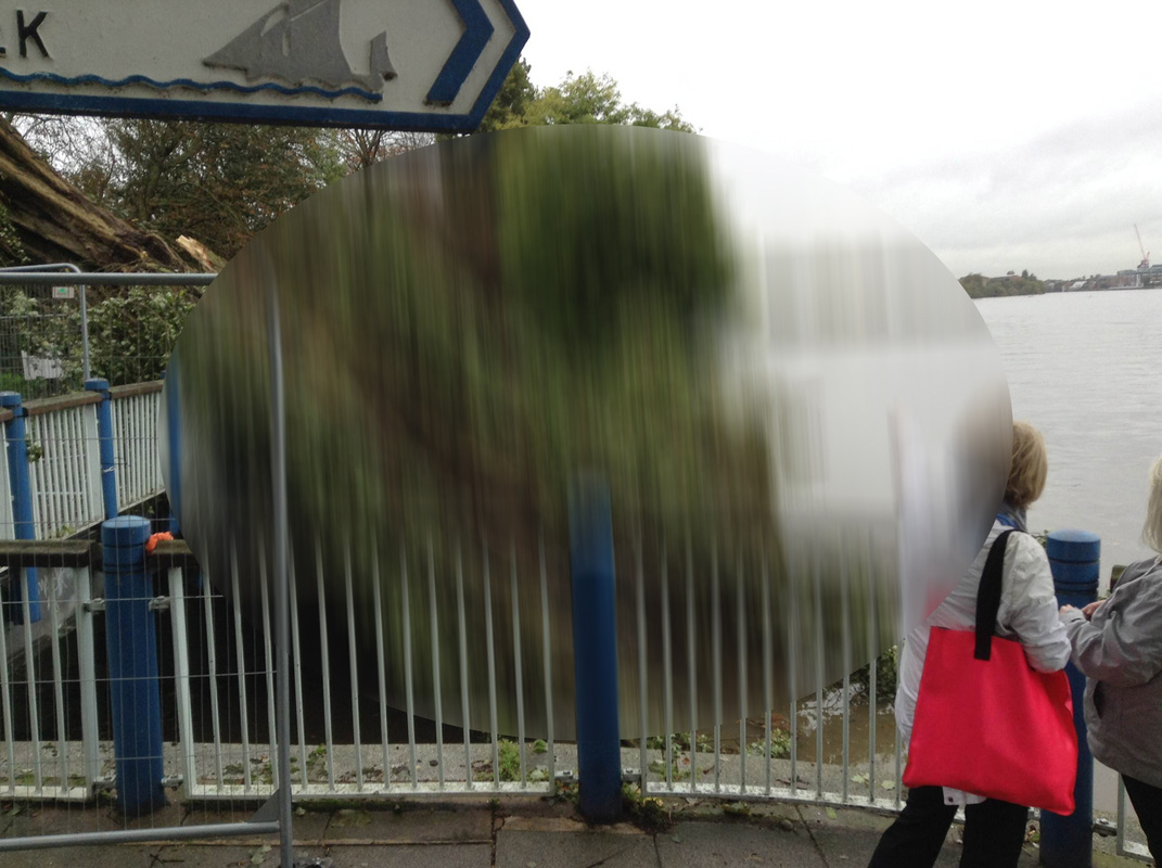
I began my first image in photoshop by using the basic rectangular marquee tool, to section off which areas of the photo I wanted to blur. Unfortunately, whilst editing it in photoshop I accidentally rotated the image a few degrees around and I didn't know how to fix this problem. Although this does slightly contribute to the abstractness of the original photo, I still think it is ineffective as it doesn't look as professional as it would if it was the right war round. I liked this picture more than the previous one I created, I think that the elliptical marquee tool is more effective than the rectangular one as it produces more interesting photos, such as the one on the left. This is the photo which I like the most out of developing these series of photos on photoshop. It is the most interesting photo to look at out of all of them simply because it is the most unique photo, and is also the sort of photo you wouldn't normally see when visiting an art gallery. When we began the abstract unit, we discussed that abstract photography isn't usually conventional and I think that this photo isn't conventional whatsoever. This is the final image which I created in photoshop, and is the only picture which I didn't use motion blur to create the image. I instead used the smudge tool which you can acess through the blur tool on photoshop. I believe that this is an image which isn't as effective as the others. If I was to improve the image I would have some sort of structure or perhaps pattern when using the smudge tool. This would make it look nicer to look at and have more of a sense of organisation over its chaotic feel. 
|
Using motion blur on photoshop
Original Image #1

|
|
|
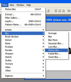
This is the section of photoshop which I used to make the motion blur series of images on photoshop.
Original image #2
|
|
|
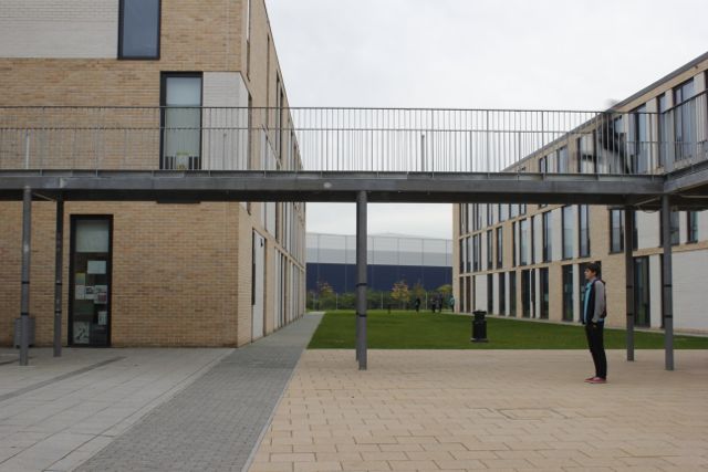
I have been looking at using focus for the majority of my work in photography. I picked focus as it is one of the formal elements of photography; a great way of creating abstract photography is specifically taking photos in reacting to these, I am therefore interested in taking pictures using focus as the main theme.
I am currently looking at the work of Ernt Haas who is very effective at using focus in his photography, by looking at the shutter speed instead of editing focus in on photoshop (much like I did with the images above). Over half term I plan on creating pictures in response to Ernst Hass work, which will hopefully resemble the work which he does (after all - all his images are very cool). I could perhaps tackle this by taking picture of on-going traffic, through taking a picture from a high point, for instance a bridge.
I am currently looking at the work of Ernt Haas who is very effective at using focus in his photography, by looking at the shutter speed instead of editing focus in on photoshop (much like I did with the images above). Over half term I plan on creating pictures in response to Ernst Hass work, which will hopefully resemble the work which he does (after all - all his images are very cool). I could perhaps tackle this by taking picture of on-going traffic, through taking a picture from a high point, for instance a bridge.
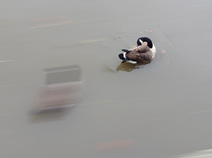
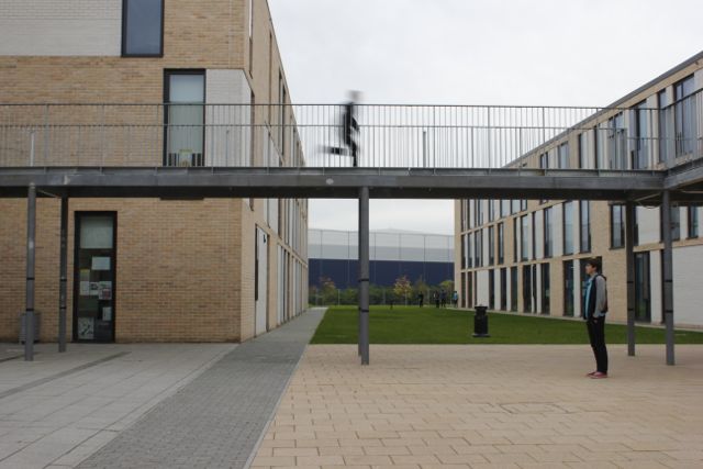
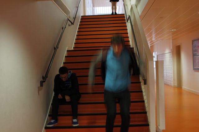
Using motion/background blur with a camera
I wanted to extend my knowledge of creating motion blur images however instead of using photoshop I also wanted to know how I can create this effect using only the camera (this would be similar to how Ernst Hass created his motion blur photographs). To create motion blur I would photograph a moving subject running, jumping and climbing in each photo; doing this with the combination of a setting my shutter speed to approximately 1/20th of a second, I could create a series of motion blur photographs without the aid of photoshop.
SET #1

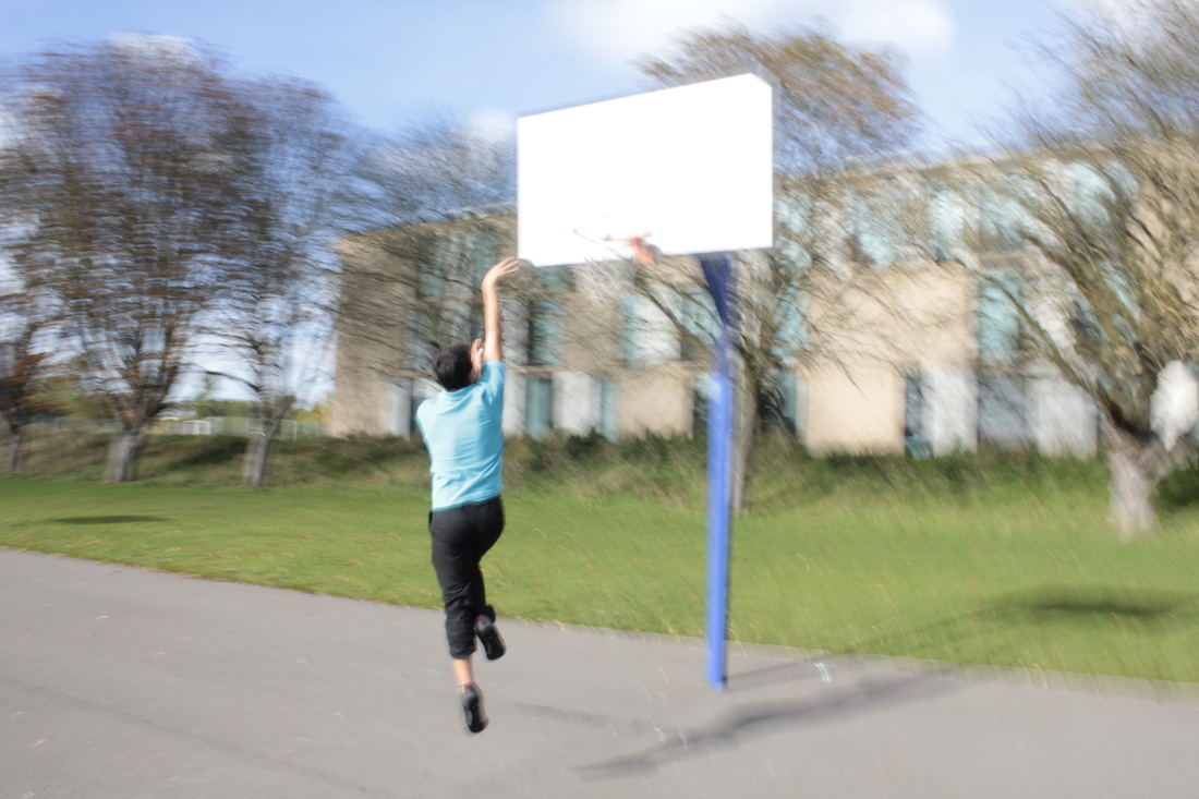
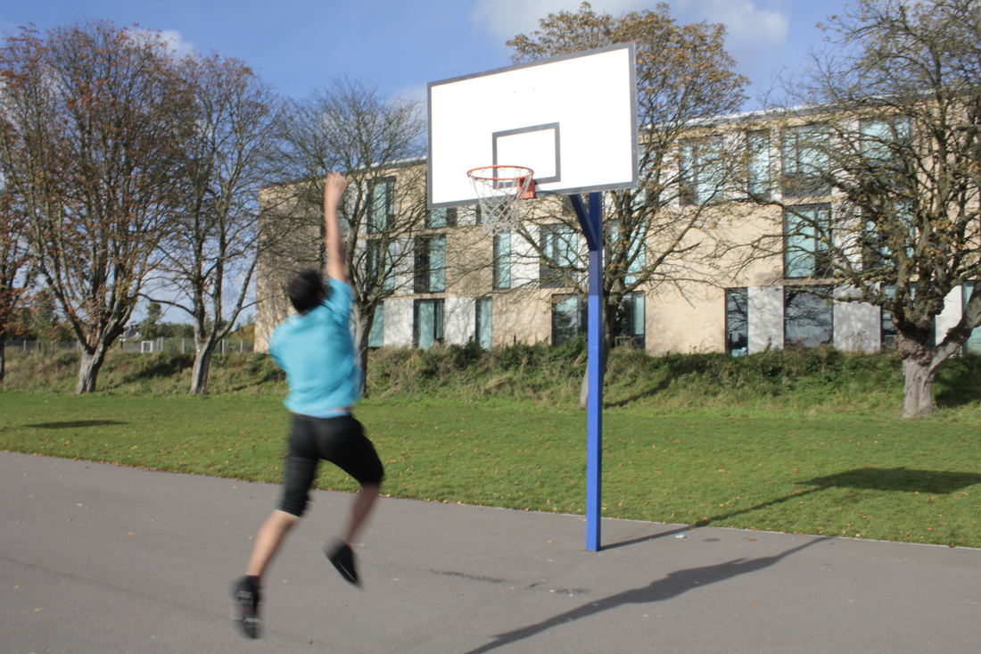
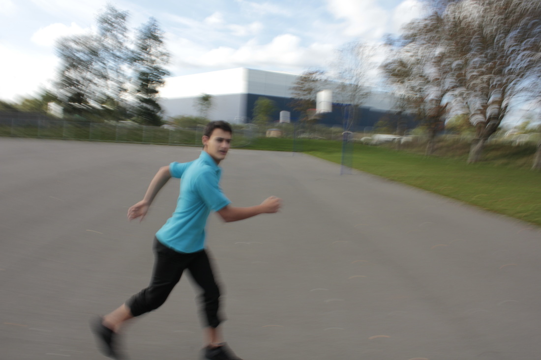
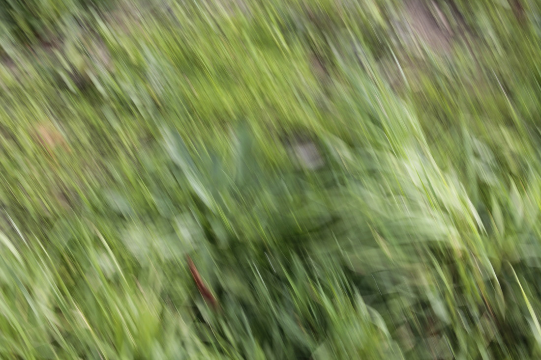
SET #2
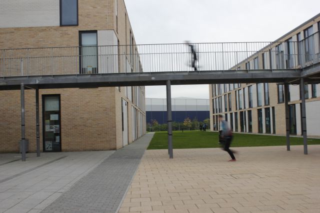
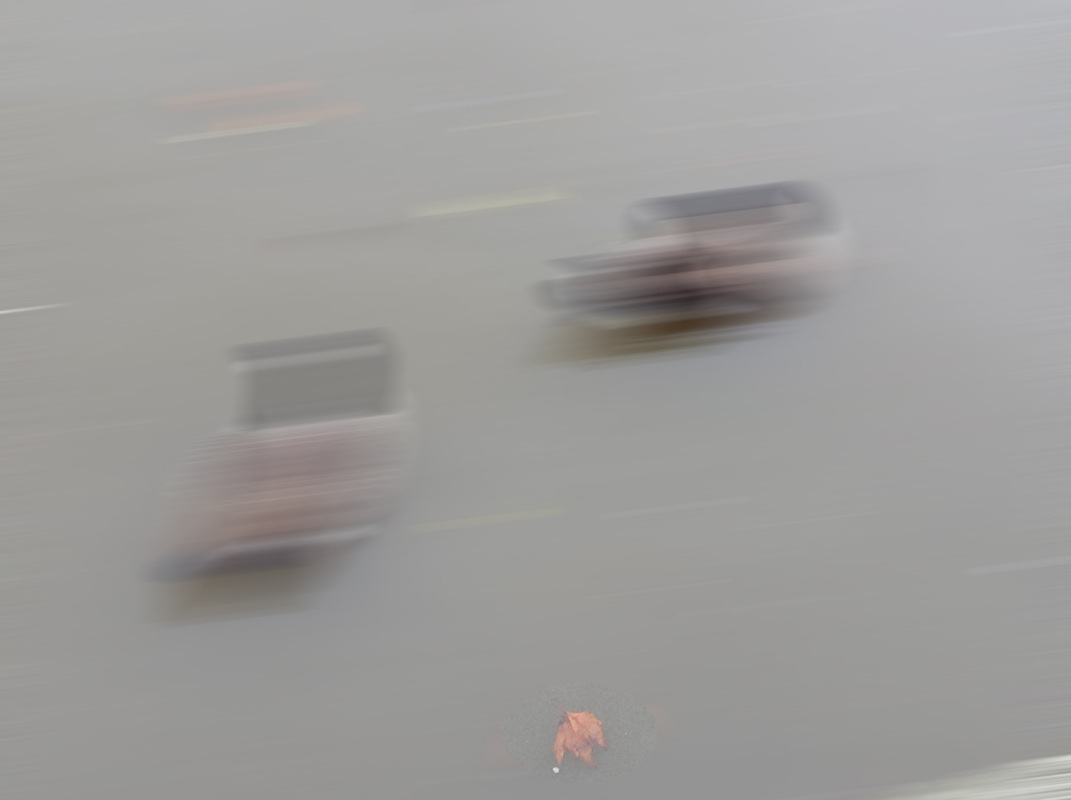
The problem with these set of photos is that a few of them don't quite hit the abstraction criteria. In certain photos, there isn't enough area of the photo which is abstract (unrecognisable), such as the photos of the blurred character on the link.
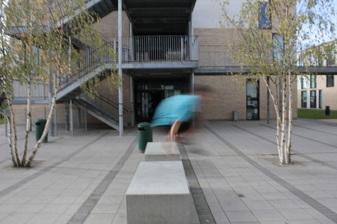
This is the photo I was most impressed out of all the photos I took in these 2 sets. You get a really lovely contrast between motion blur and parts the photo which are still (the background in particular). Another aspect which I like about the photo is that not all of the image is dominated by the motion blur, instead only a small part is and by doing this you get a compelling image.
|

The part I hate about this is that the section which is motion blurred is too close to the edge of the photo therefore you don't notice it immediately, which isn't a good thing. As well as this too much of the image is still which means that it doesn't quite hit the abstraction theme sufficiently.
|
Minimalism
I have always been a fan of art which contains the least amount of substance possible. As well as photography... different aspects of minimalism can be noticed in films, for instance Sophia Capolla's film Lost In Translation and The Master, directed by Paul Thomas Anderson contain these subtle minimalist elements which give each film an intriguing and sophisticated effect, which makes them very interesting to watch. What's best about how these directors have made these films, is that if you were to take a random screenshot of any of these films, the shot would have a similar atmosphere to a minimalist photograph.
Minimalism in Lost In Translation
|
Minimalism in The Master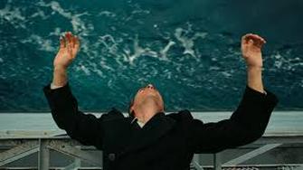
|
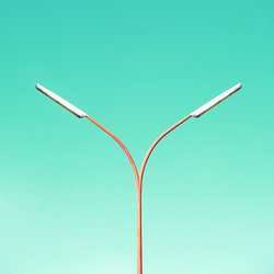
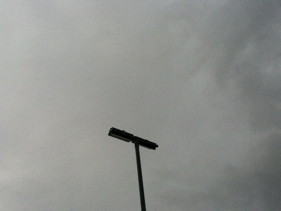
Matthias Heiderich is a photographer who uses numerous aspects of minimalistic photography in his work. What I like most about his work is how he takes pictures of simplistic architecture, which isn't usually a subject which is explored in photography. What I also like is how he combines this with the pastel colors in the background of each of his photographs.
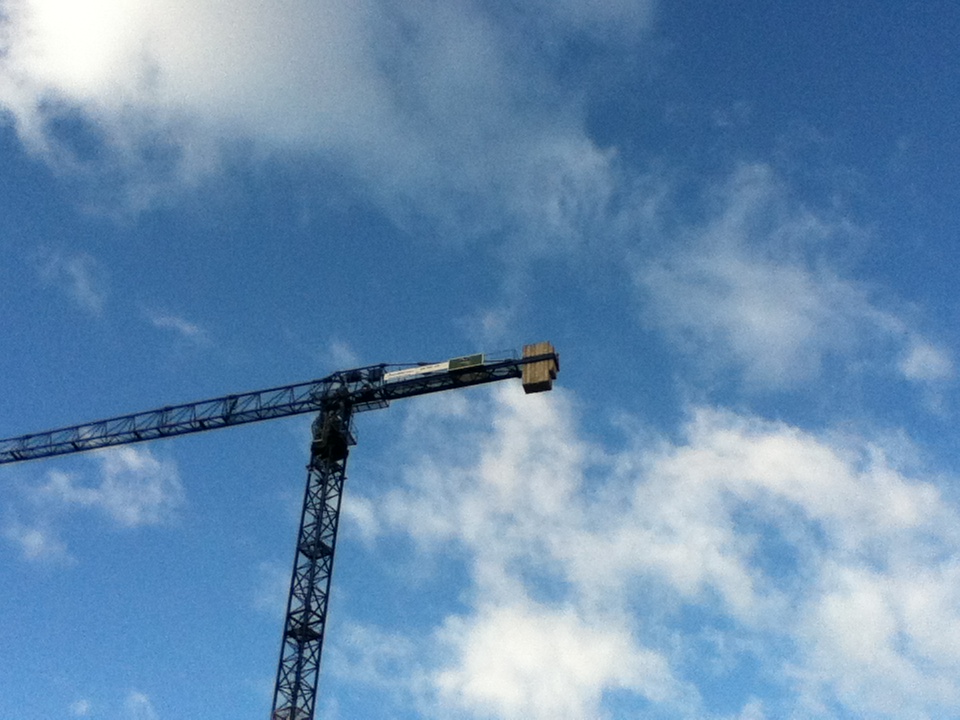
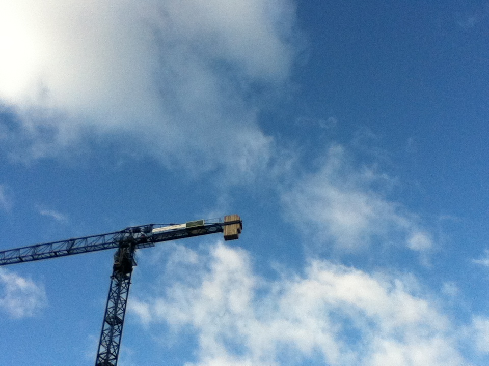
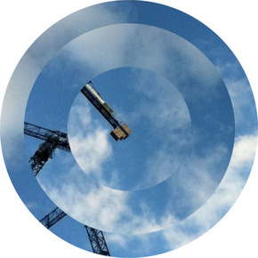
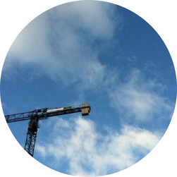
When I visited both Margate and Sutcliffe park on the photography trip, I attempted to create a series of photos which use the same ideas and principles which can be noticed in the minimalistic workings of Hinderich. I did this by capturing pictures of different pieces of architecture & design (for instance lampposts and the crane) in and around the locations which I was in.
When I visited both Margate and Sutcliffe park on the photography trip, I attempted to create a series of photos which use the same ideas and principles which can be noticed in the minimalistic workings of Hinderich. I did this by capturing pictures of different pieces of architecture & design (for instance lampposts and the crane) in and around the locations which I was in.
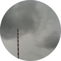
Suttcliffe park
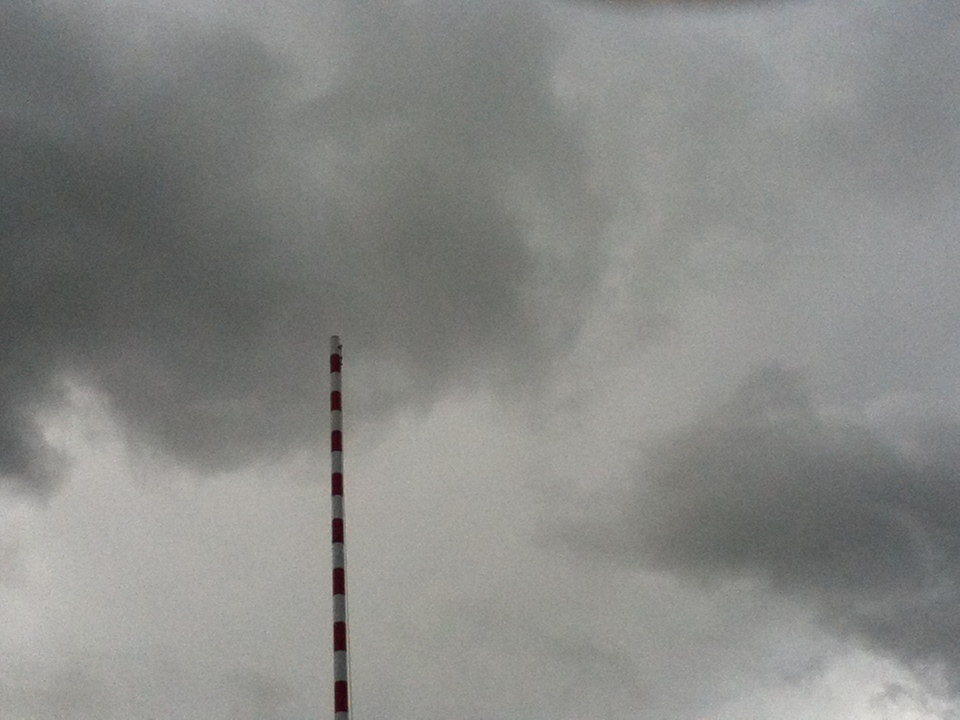
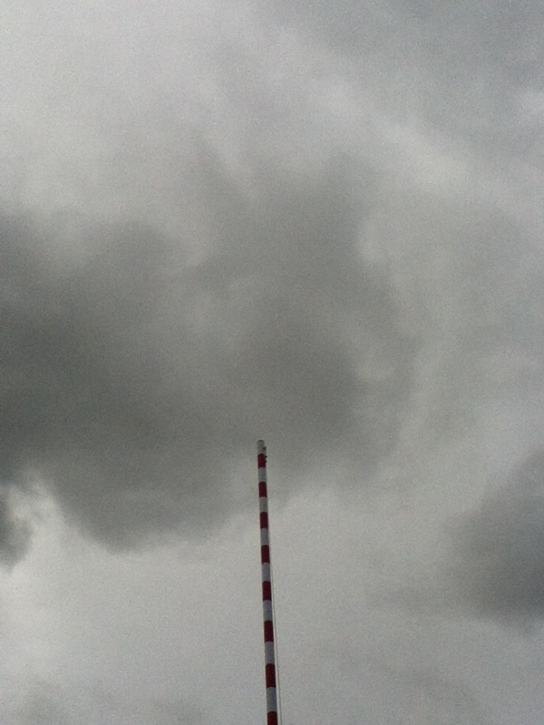
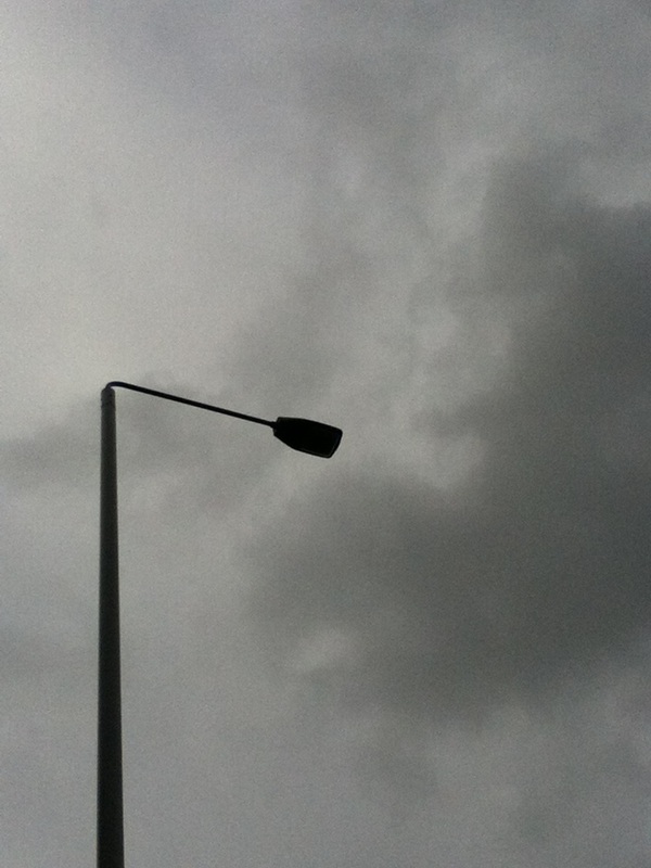
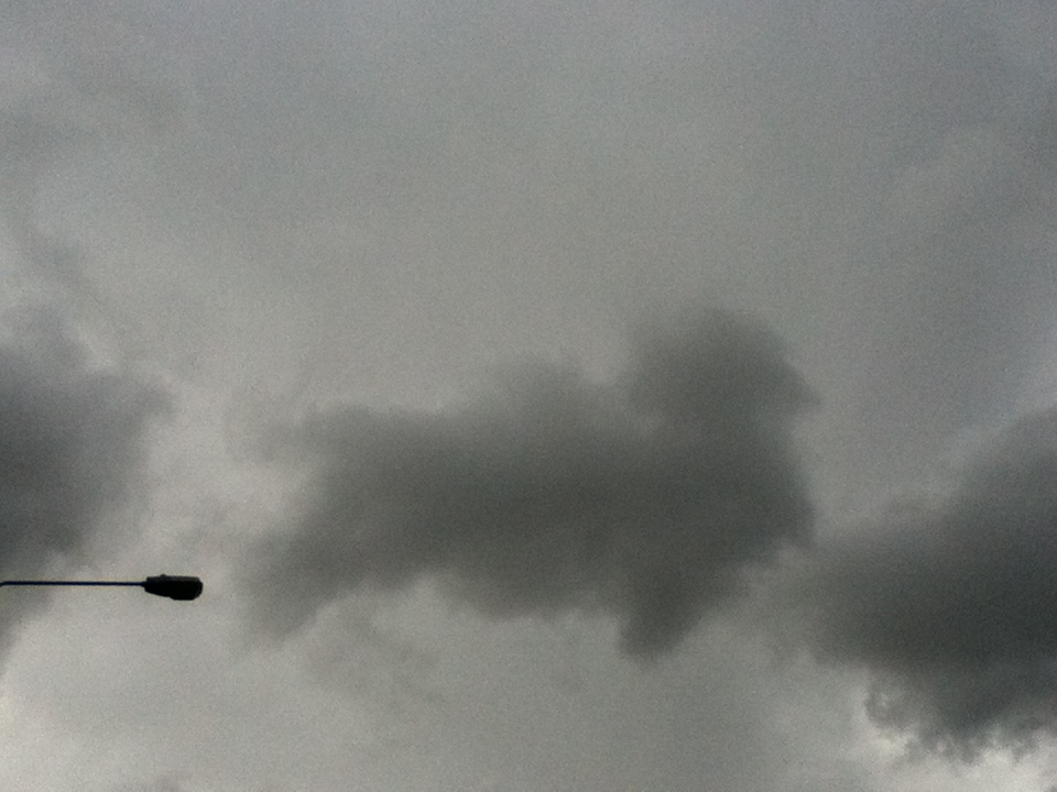
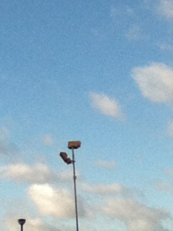
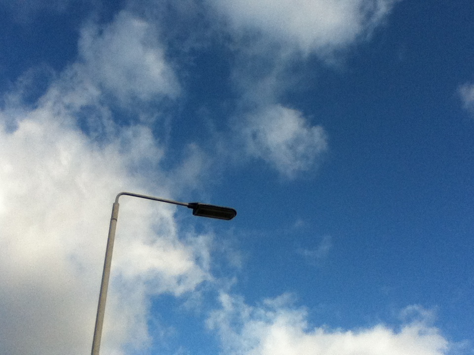
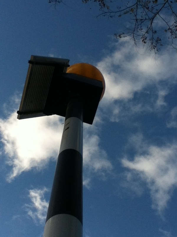
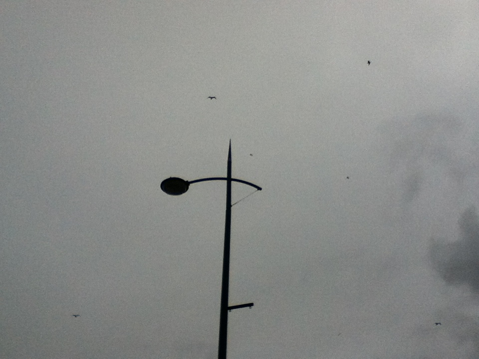
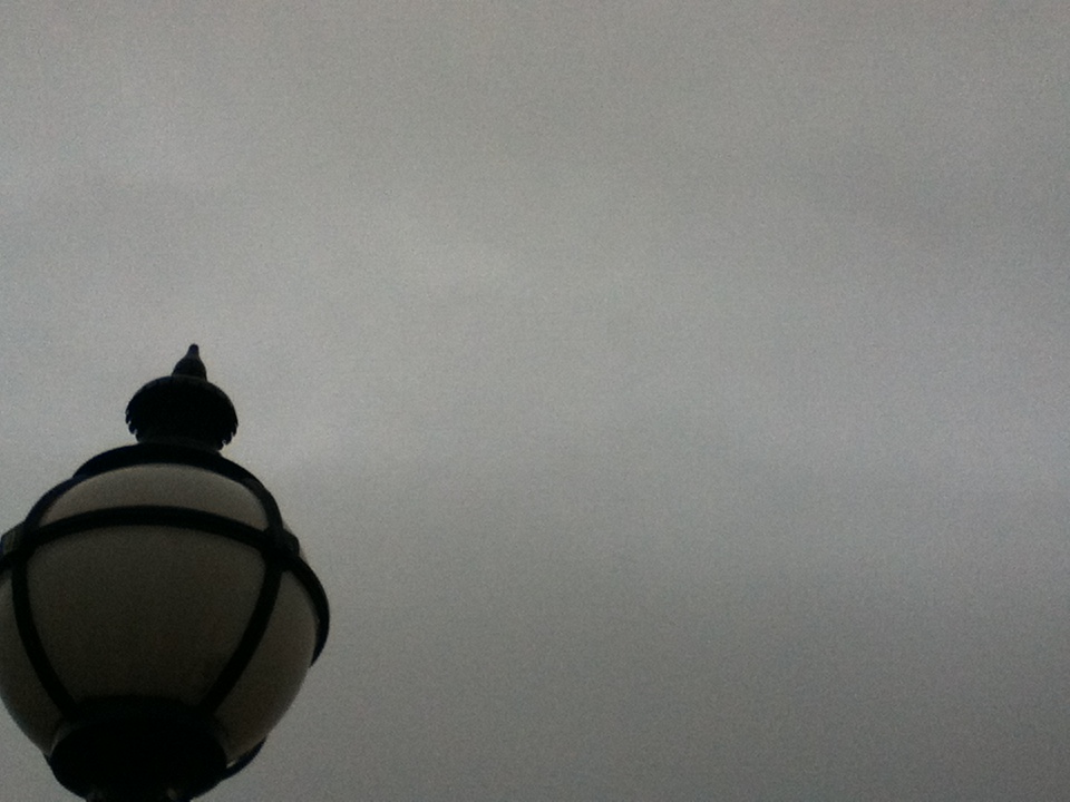
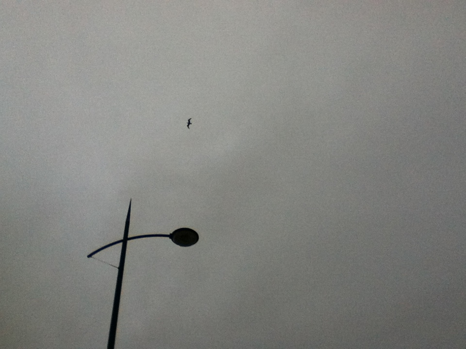
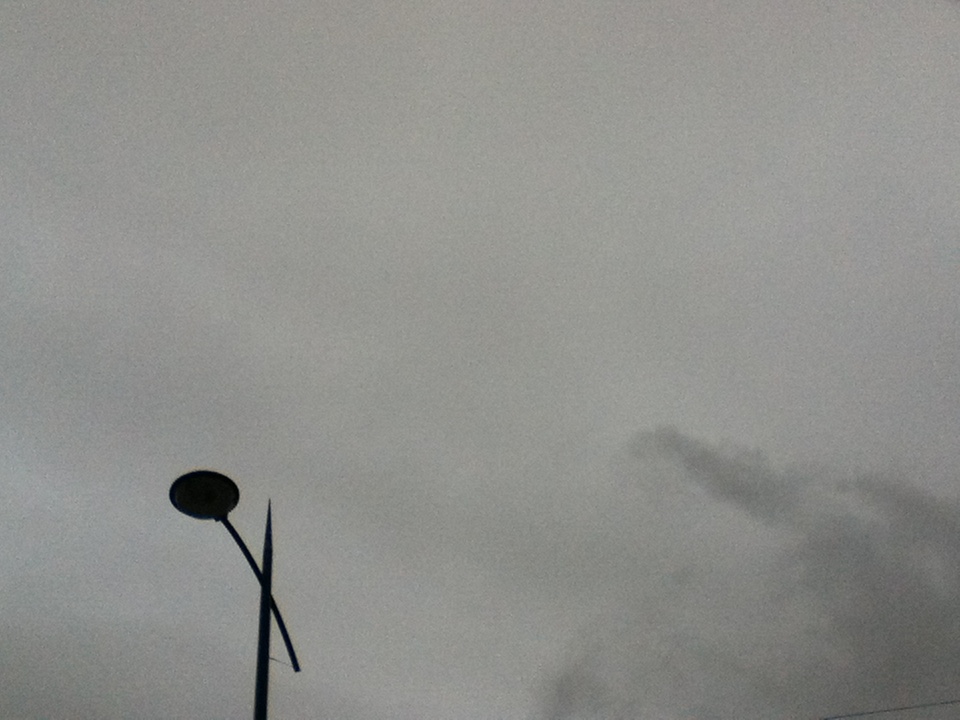
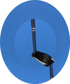
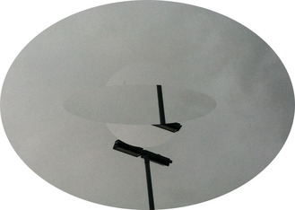
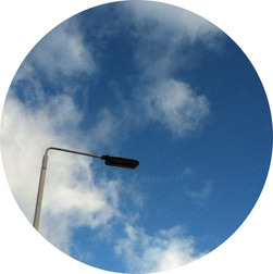
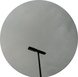
When taking photos in Sutcliffe park, I thought an effective way of creating minimalistic photos is to turn things high up in the air (including the background of the sky) and make, what I am taking a photo of, look like something different to what it is. This is effective because it is experimenting with form and how things look from different perspectives . A consistent example of this in my photos is when I took photos of lampposts and made them look like strange vertical objects. As well as this minimalistic theme, most of the photos also contain the element of light and shade, as many of the photos are presented with a grey background and the object has a certain shade of black.


My favorite image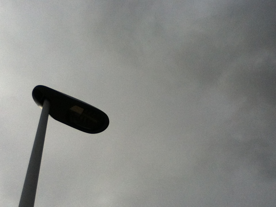
I decided this is my favorite image from the tone selection as it really hits the nail on the head in terms of how it reflects minimalism, therefore successfully becoming an abstract image. This is due to how simple the picture is, the usage of the lamppost is really unique as without knowing what it is, it is difficult to come to a conclusion. I am very pleased with this image due to to the fact that it expresses solitude; which is a quality I admired in the Lost In Translation and The master film (I.e the pictures above).
|
My least favorite image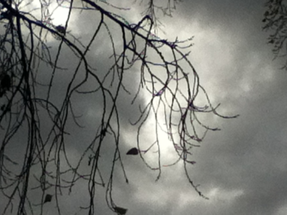
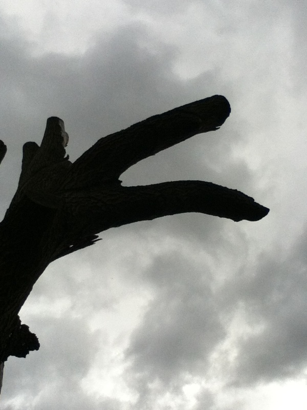
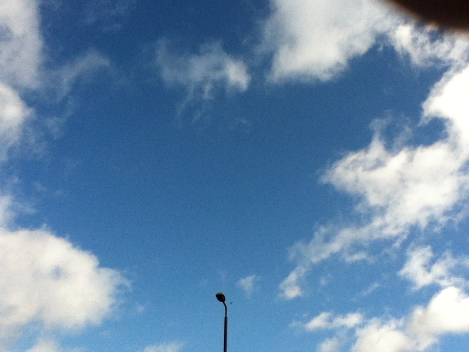
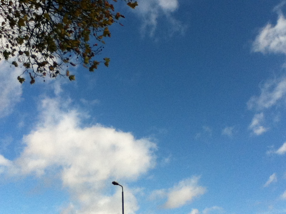
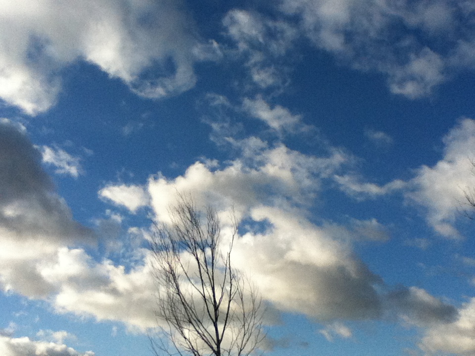
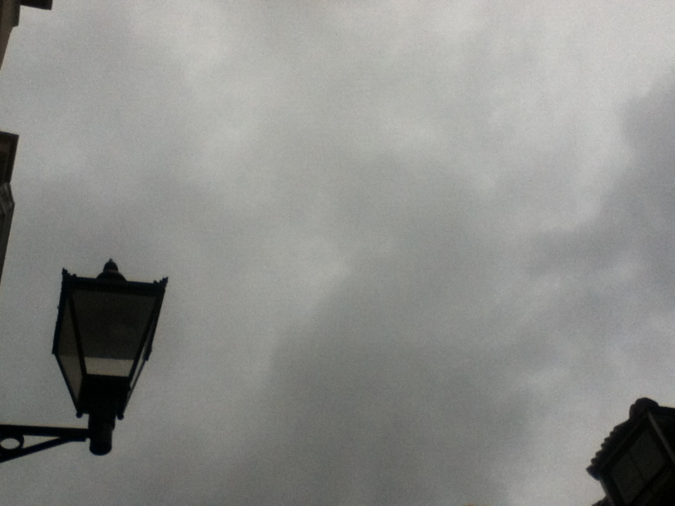
To me, this photo seems as though there isn't enough space in it for it to be sufficiently referred to as a minimalistic photograph. I also believe that it doesn't really have any similarity to the photographer which I am focusing on, therefore i don't think that it is a successful photograph (even though it doesn't look bad as just a photo). If I was to improve the photo I would make sure the photo contained much less of the tree and more of the photo had the background in it. Although I feel this is quite a successful photo in some ways, it doesn't have a very cinematic feel which the others photos contain.
|
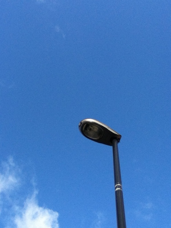
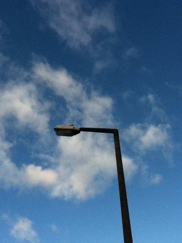

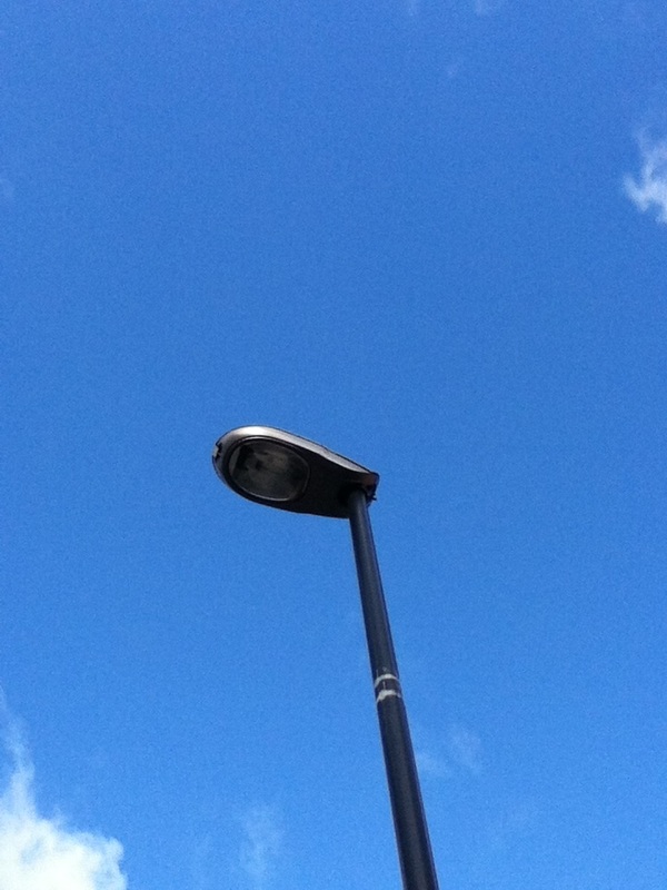

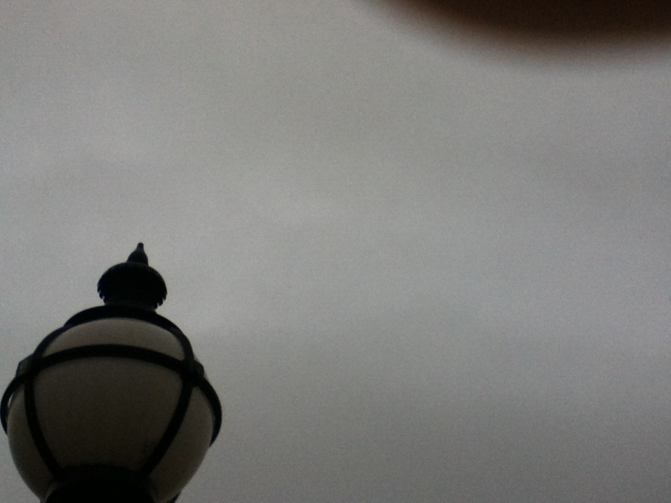
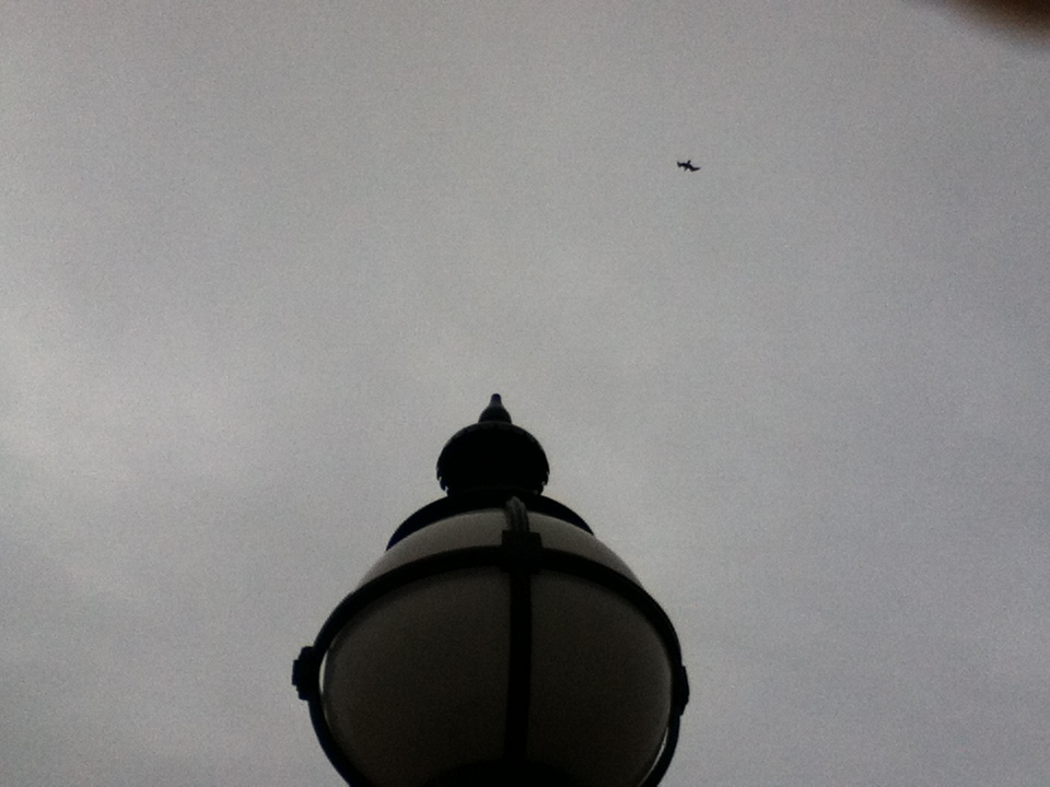
This was my favorite image which I took on the journey to Sutcliffe park, and so far my favourite minimalist photograph which I have taken. This photo has really basic properties (i.e the large space in the photo and the form of the lamppost) which contribute to the overall effectiveness of the photo. Although in the top right hand side of the photo, part of my finger covers the lens slightly (which personally I think can be forgiven; as it's such a great photo) therefore if I was to improve the photo even further then I would remove my finger from covering the lens.
|
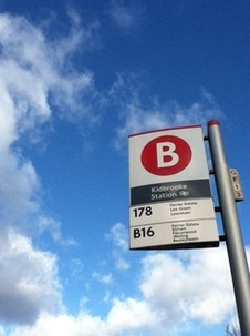
I have chosen this photo as my least favorite because no experimentation with form is done in this photo, unlike the other photos which seem to transform different objects to make them look like what they are not. In this one we can clearly tell that what is being photographed is a bus stop sign.
|
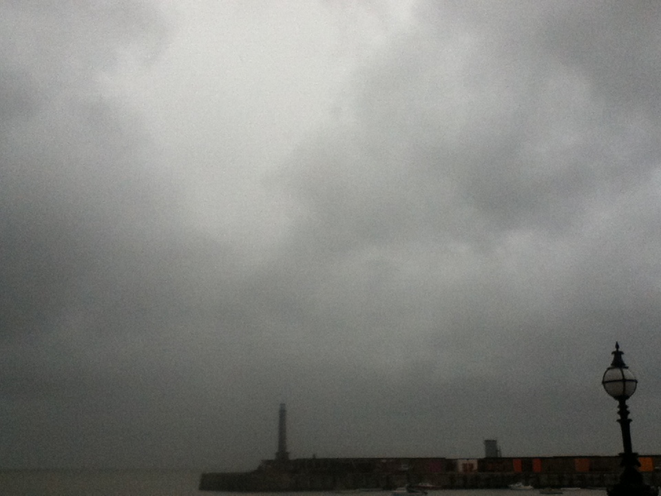
Margate
We also visited Margate and I decided that I would carry on with the theme of taking minimalistic photographs. I did this by walking along the coast and taking pictures of any objects which I felt had a sense of 3D/elevation (such as light on the street).
Overall I think the photos I took in Sutcliffe park were more effective; especially in terms of how they reflect abstraction and how they reflect the work of Matthiaus Hinderich. The reason why I believe this is quite a few of the photos I took, the objects which are in the photos are easily recognisable, which therefore means that they don't successfully hit the abstraction criteria.
|
|
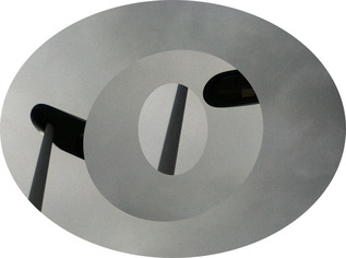
I decided that I wanted to take my minimalism photographs further, by using how I would display them to my advantage. I find that the problem with these set of images is that the minimalism theme is broken therefore if I were to use minimalism in my final piece I wouldn't create these complicated layers; it ruins the minimalism theme. Another problem I have with these set of photos is that the circles are not all equal size, if I were to
I knew I had to make a new series of images which are similar to the ones which I made in the previous series therefore I created these, which have more naturalistic properties to them (instead of cutting and sticking different layers on to the backround image), which I prefer compared to the last series as a contrast between the abstractness and the naturalistic properties creates a successful series of photos.
|
|
My Final Piece
For my final piece I wanted to incorporate the images I last created with minimalism and be able to explore abstraction further, especially in terms of how I exhibit it. My initial idea with creating this was too present the circular images adhered to a larger sheet of paper; so that they were organised in a polka dot fashion. The first reason why I didn't want to subject to this is that I felt that it would be copying the work of Damien Hirst, in which he uses colorful dots to create a piece of art. The second reason why I didn't want to do this idea is that I felt the images would look much more successful if they were presented bold and large instead of small and almost unnoticeable. I also thought that these images would not be effective if they were merely presented in a two dimensional style therefore a more striking and original presentation would be required. I imagined the pictures floating in mid-air (as if they were orbs), viewed from all sides would create a more imaginative approach. Alexander Calder was an artist I investigated who created large colorful mobiles which have a minimal theme; similar to what I was considering.
Alexander Calder
|
Alexander Calder was an artist who was born in Philadelphia in 1898. He originally studied engineering at university however after working in several jobs he decided that his skills lied it art thus began studying painting in New York towards 1926. His first one-man exhibition was in New York at the Weyhe gallery in 1928.
|
|
Instructions to make a minimalism mobile
|
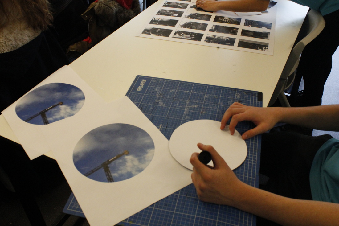
1) Cut out a circular piece of cardboard, with the diameter of roughly 9 inches.
|
|
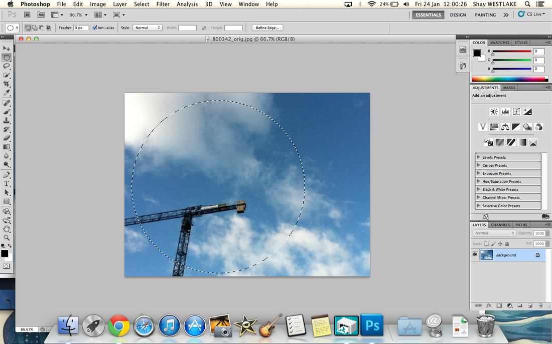
2) On photoshop, use the circle shape tool and use the shift button (to be able to create a perfect circle) to cut out a circular section of your minimalism image.
|
|
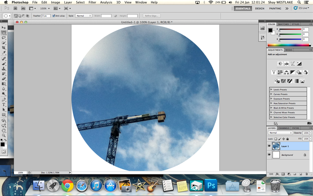
|
3) Copy and paste this image on to a separate window on photoshop, so that you are able to export the circular image on to the desktop.
|
|
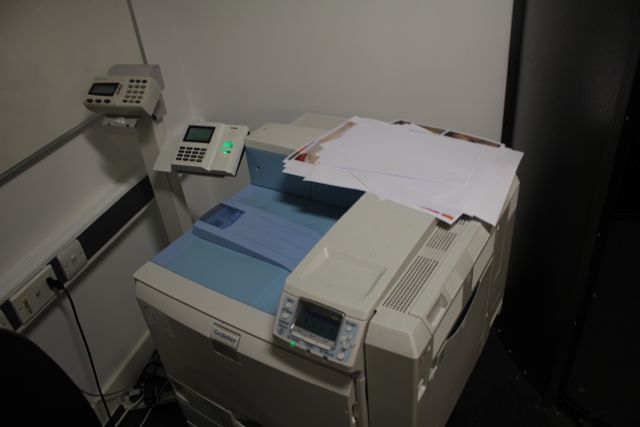
4) Print two copies of your photoshopped circle on to A3 pieces of paper, so that you are able to stick it on to either side of the cardboard circle.
|
|
|
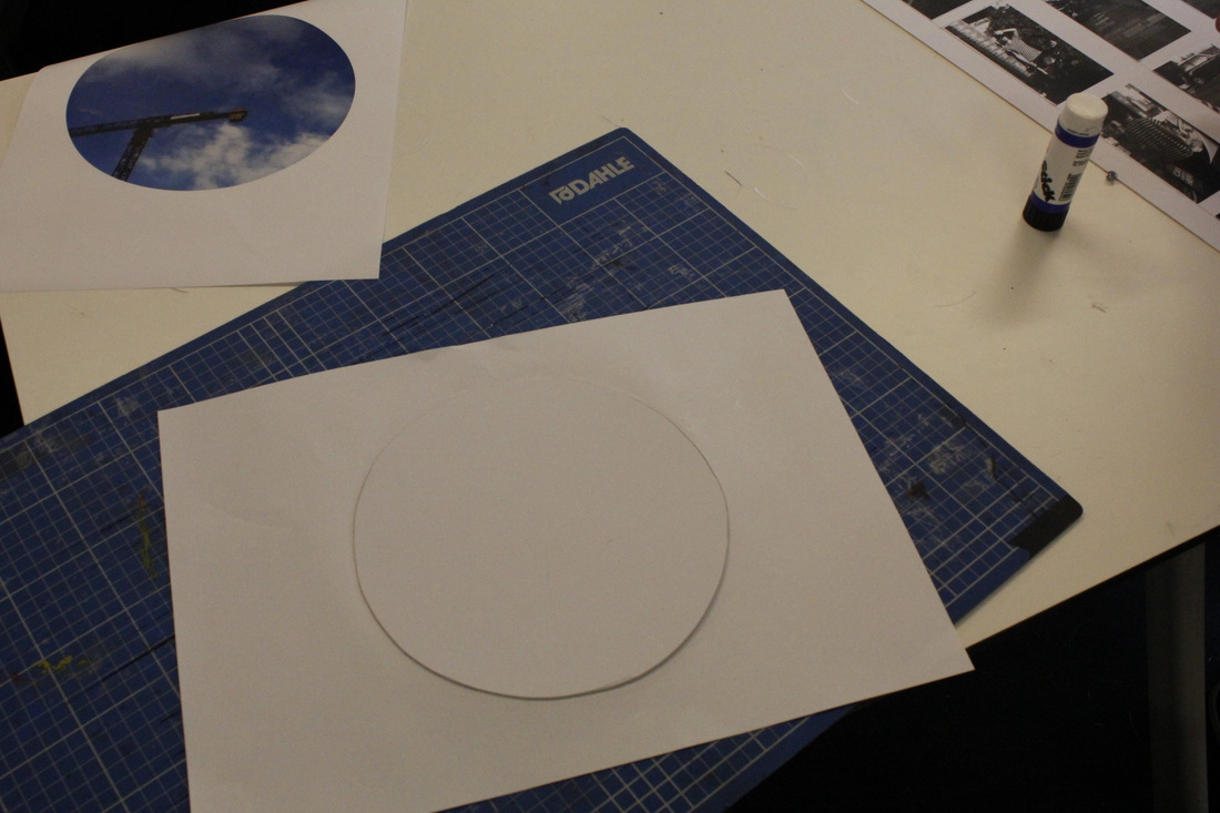
5) Glue one side of the cardboard cut out so that a thin layer of glue covers the whole side of the circle (so no paper is able to peel off).
|
|
6) Glue the circle on to the piece of paper so that it is ready to cut out (we do this before it is cut out because it will make the edges smoother and it takes away guess work).
|
|
|
7) Repeat the last two steps but on to the other side of the cardboard, so that both sides have your image on them.
|
|
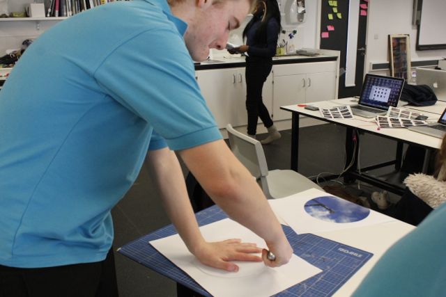
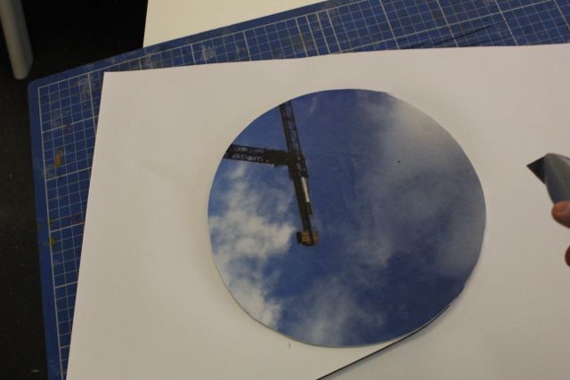
8) Cut out the piece of cardboard so that there is no excess paper around the circle.
|
|
|
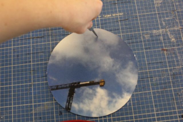
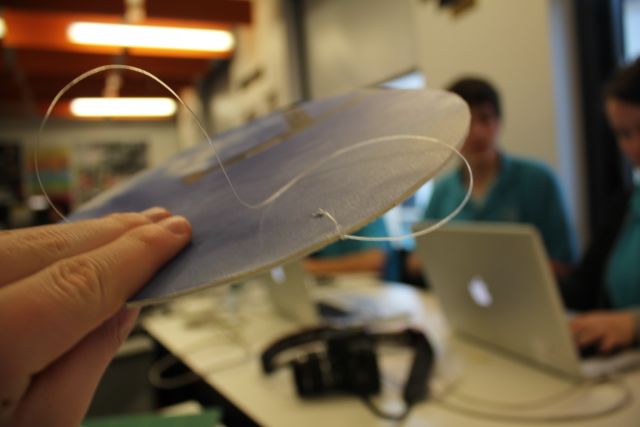
9) Pop a hole in the top of the circle with a screwdriver; this will be the hole that you feed the wire through, so that it is able to hang from a object.
|
|
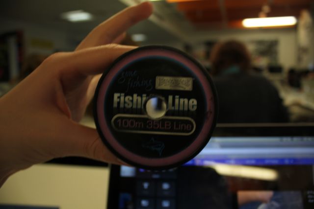
10) Use roughly a meter of fishing wire, this should be a sufficient length to use (however feel free to use a longer piece if necessary).
|
|
|
11) Tie a granny knot (like how you tie your shoes) in the hole of the circle, so that the wire doesn't fall out of the hole and is secure enough so that it is able to be hung from a ceiling.
|
|
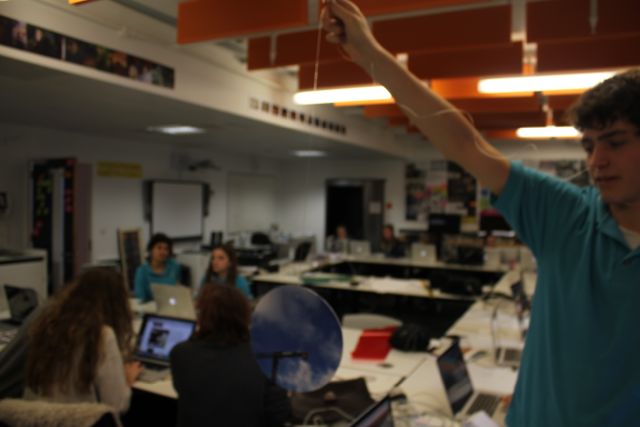
12) You now have your very own minimalism mobile. Repeat the process to create more variety in how you present your mobile(s).
|
|
